A ballet triple act.

Jerome Robbins’ “The Concert”. A comic piece depicting the audience of a piano concert (which is an actual piano concert being performed on the stage). In my opinion the piece has aged really badly. Its home is clearly in the 1950s, and I don’t understand why anyone would think this silent movie aesthetic was worth dusting off. I guess it was fresh and new when it came out, maybe? All I saw was people reduced to caricatures, and then ridiculed with no warmth. There’s the stern housewife, the cowed husband, the nerdy boy with big spectacles, the flirty hussy. All we’re missing is a plucky black mammy and a squinty-eyed chinaman, to make the collection of clichés complete. I always struggle with second-hand embarrassment but this actually made me angry.

Jerome Robbins’ “In the night”. Three episodes depicting three phases of love. Pretty but not particularly interesting. The piano music by Chopin was the best part of this evening.

George Balanchine’s “Theme and variations”. An artful, technically splendid display of skill and precision and grace, but to me it mostly felt artificial and contrived. There was no room for the dancers to show any personality or any expression other than a fixed, glued-on smile. I couldn’t help wondering if all the dancers had been chosen to match each other’s length and hairstyle.

All of these choreographies date from the second half of the 20th century, so I was expecting something a lot more modern.


We started both yesterday and today with luxurious breakfasts at a café that Ingrid had found online. Pluk on Berenstraat, in case you find yourself in that area. The online reviews are very mixed but we got very good food, though the service was rather slow.

We had seen enough canals and crooked houses and cute little streets yesterday and wanted something different today, so we went to the Rijksmuseum.

The museum was very visitor-friendly, with easy-to-read maps that guided people to the most popular paintings, but also to other parts of the collection. The popular works – like their one and only Van Gogh – had large crowds in front of them, so I didn’t even bother to try and look at those. There were plenty of other interesting things to see.

Even though we all walked in the same rooms, we often split up because of our diverging interests. Ingrid is interested in art and paints herself, so she looks at details and technical aspects that Adrian doesn’t care much about. So she and Eric (who also painted when he was young) looked at the paintings with artists’ eyes, while Adrian and I looked at them with general curiosity.

We noted, for example, the prevalence of grapes, glass bowls, and curls of lemon peel in 17th century still life paintings.

The curators at the Rijksmuseum had done a great job with the signage. All too often, museums label each work with its title, maker and year, and nothing more. Here there were often interesting background facts, and info sheets with even more facts and stories.

When we tired of paintings, we looked at cannons, porcelain, Delft pottery and ship models.

I liked this glass vase by Émile Gallé, with its irregular patterns borrowed from various cultures.

And this repeatedly darned sock, found in a seaman’s chest after a shipwreck.

From high culture to low. In the afternoon we took the boat to North Amsterdam to a large flea market that Ingrid wanted to browse for vintage clothing. She didn’t find anything that fit, but I bought a jacket.


We have tickets for a chamber music concert series at Konserthuset and the first one was today. Piano, cello, violin and percussion.

Pejacevic’ piano trio was music of the romantic kind, definitely impressive but not to my taste. The kind of music where everything blends together and it’s a mass of notes rather than a melody. I find it difficult to keep my focus on this kind of music, to the point that I begin dreaming while awake. My brain has nothing to hold on to, so it starts making things up.

Shostakovich’ symphony No. 15 arranged for a chamber ensemble. I liked this a lot better, with the dialogue between the cello and the violin. It’s an interesting piece of music, with its quotes from other famous works. It was almost bizarre to suddenly get a burst of the Willam Tell Overture in the middle of the piece. It was also clearly a technically challenging piece, especially for the strings, veering into atonality.

We had front row seats, which I particularly like for small-scale classical music, because it allows me to see the musicians’ craft up close. Which is particularly nice when I find myself zoning out.

One thing I noticed this time was a digital sheet music stand that the violinist used, with a foot pedal for turning pages. I wish I could have gotten a closer look – sometimes it seemed to only redraw the bottom of the page, and I wonder what that was about.

The cellist and the percussion section used traditional sheet music. The pianist did so as well, with the help of a page turner. That seems like it might be a challenging task – it’s not just about reading the music but also keeping track of dal segno “navigations”, being unobtrusive while waiting… and not getting distracted.

Jalet’s Kites and Eyal’s Saaba.

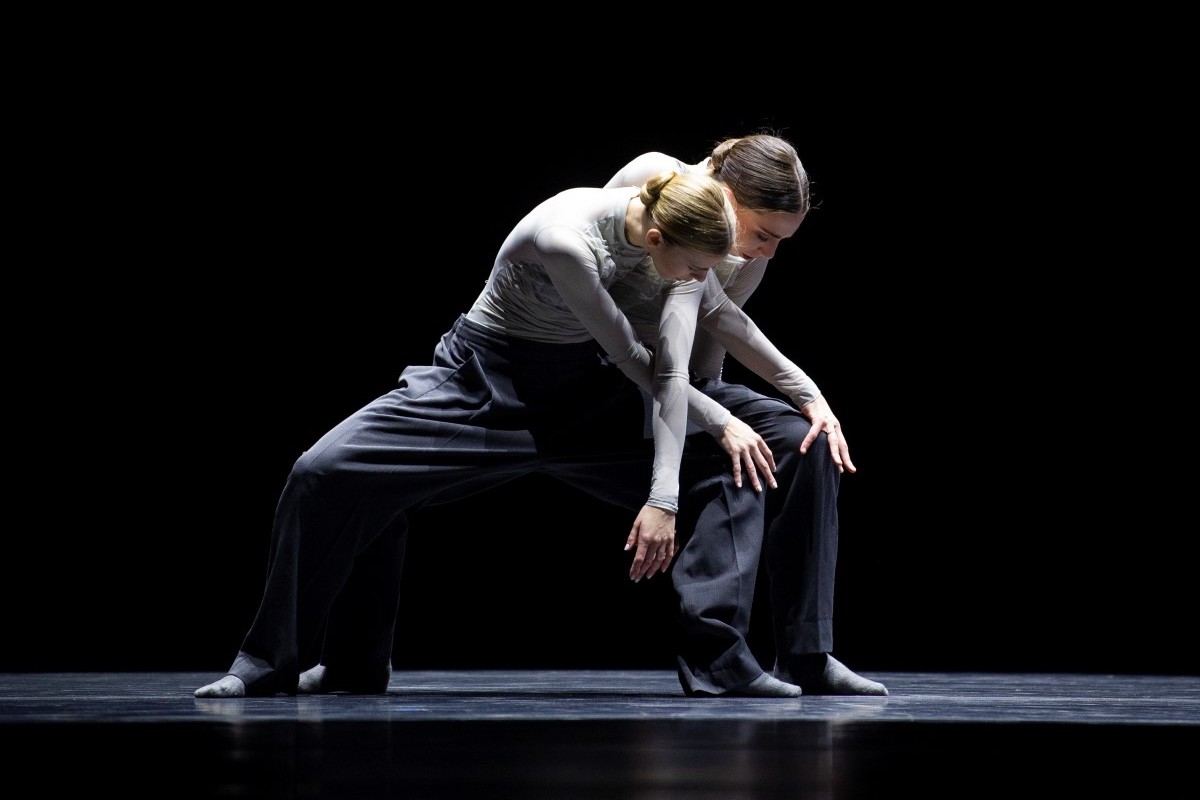
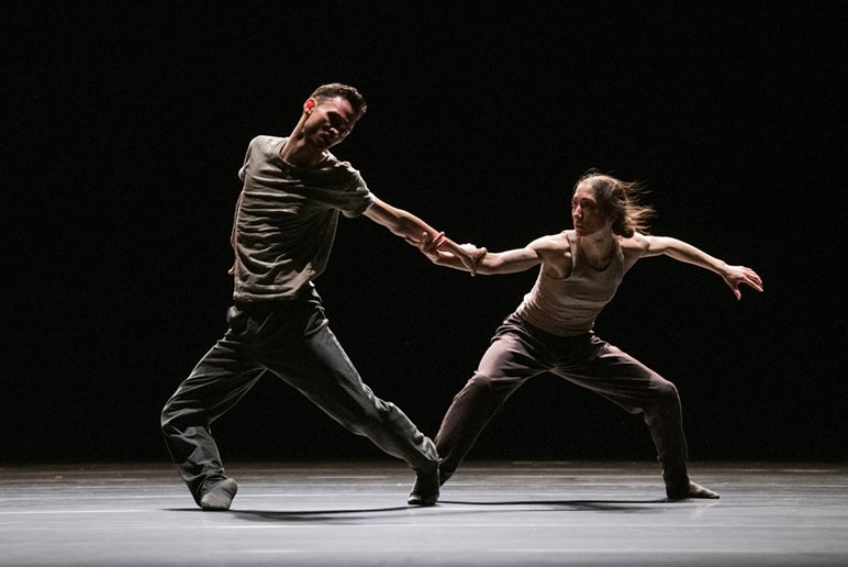
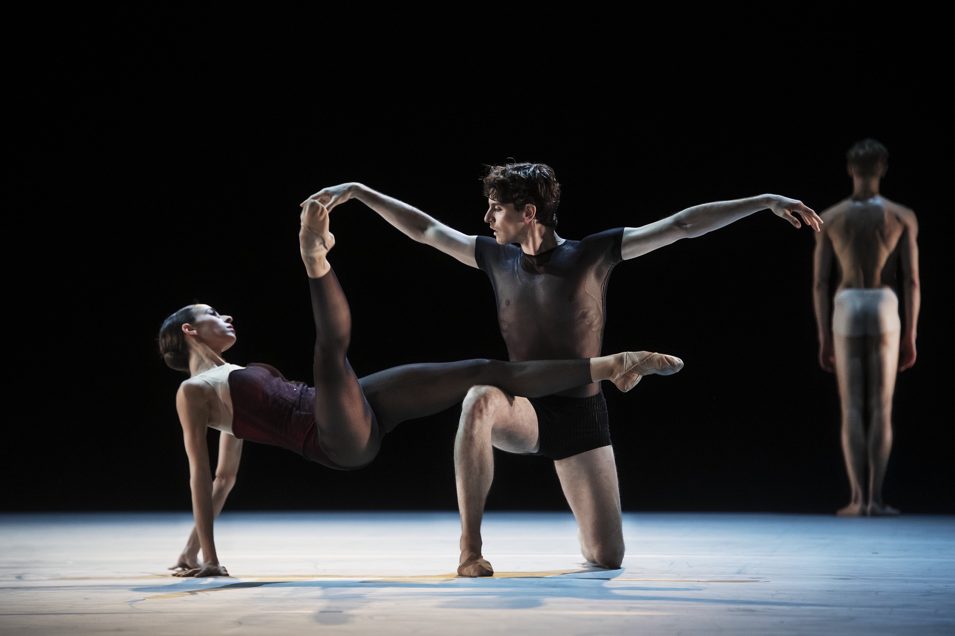
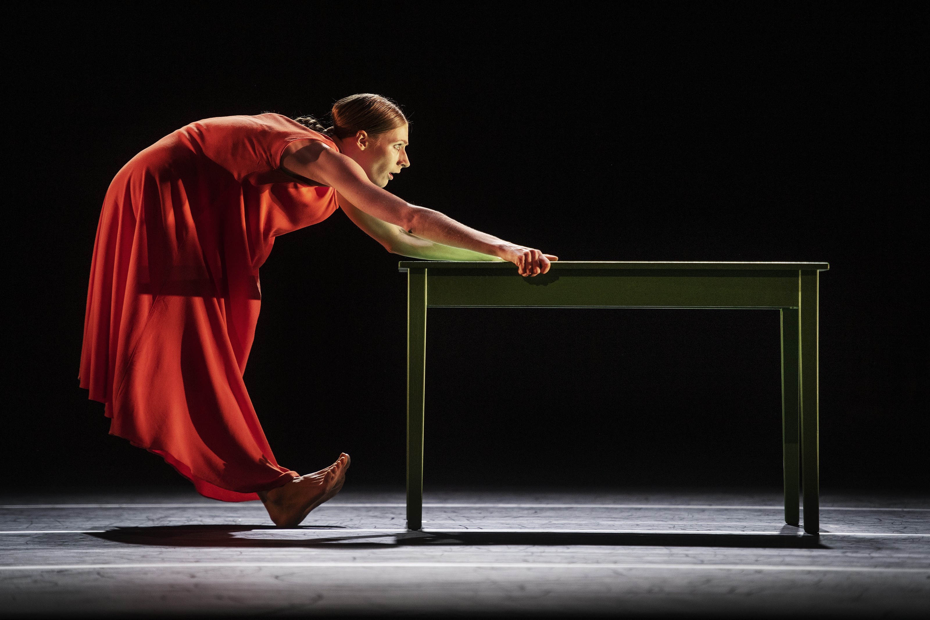
I usually post press photos in my reviews of dance performances but this time we had front row seats so I took my own. Obviously my little camera struggled with the dim lighting but it’s enough for some memories.

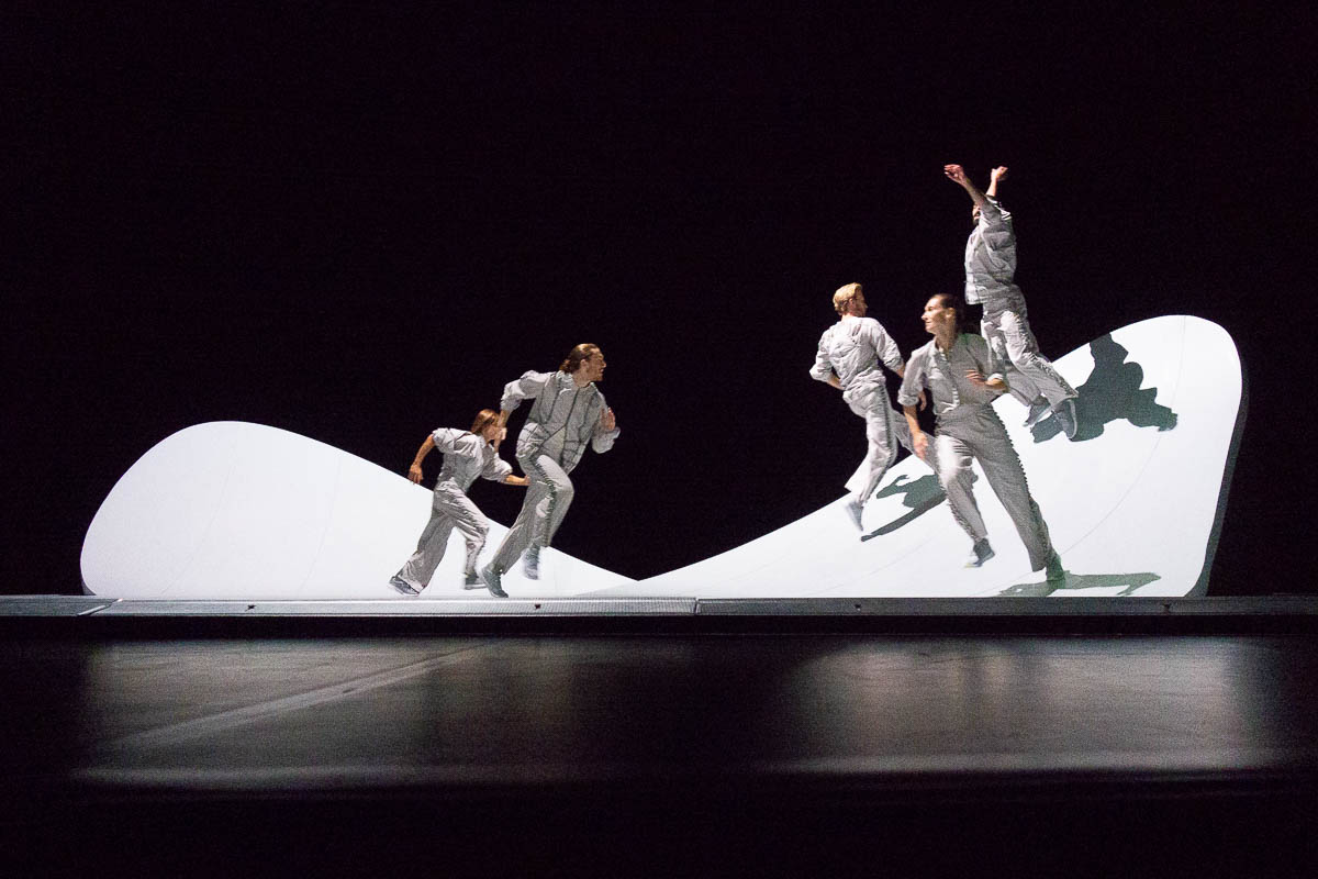
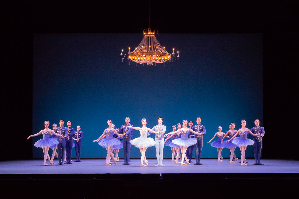
Damien Jalet’s Kites. My opinion of this piece went up and down.

First: a woman, lying down on the floor, moving to a poem about the wind. Then, a group running up and down white slopes, evoking the feeling of running in the wind. This section didn’t impress me much – I found it repetitive and lacking direction and choreography. It felt as if the dancers had just been told to run up and down the white slopes, and let their arms drag behind them. Kind of boring, but the constant motion was soothing, like looking at the foam wake behind a boat, especially together with the music.

Then the group gathered loosely at the front of the scene, dancing together but slightly out of sync. One of them starts a movement, and the others follow gradually, like a wave. The next wave had a different starting point and a different direction. It was still relatively aimless: the same kind of thing kept happening for quite a while, without any noticeable change or directionality. It reminded me of Koyaanisqatsi, music and motion blending into one, especially with the minimalist music. It made me see the previous section from a new perspective, and appreciate it a bit more. Still, my opinion of the whole piece kept oscillating between appreciating the minimalism, and finding it low-effort and boring.

The final section was gimmicky. Cords got pulled and clothes transformed – shirts blown full of wind, sparkly jackets, loosely blowing pants, glitter blowing in the wind. Childish and cheap, compared to what came before, lowering the tone.

Also, the streetwear-inspired costume design may be modern and cool but it detracted from the performance. The costumes were loose but stiff, so they hid the dancer’s bodies and made movements indistinct. A tighter design would have made the bodies more visible; a looser, softer fabric would have flown with the motion.

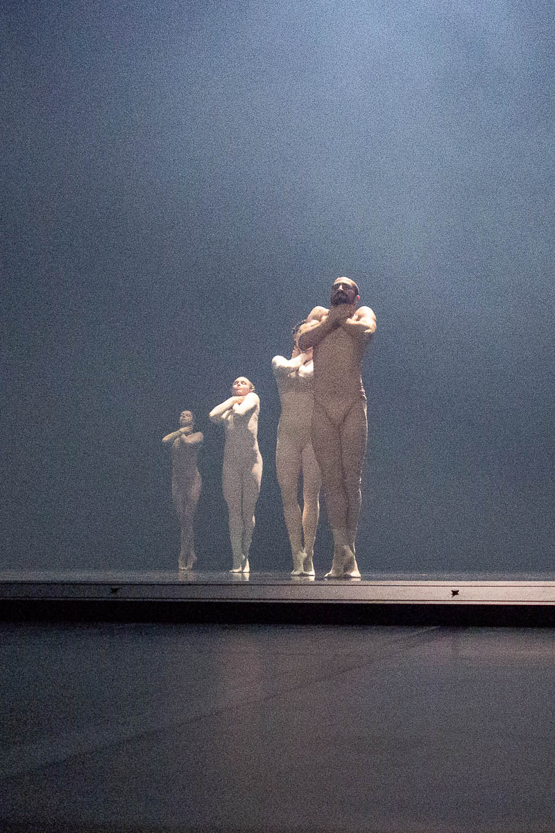
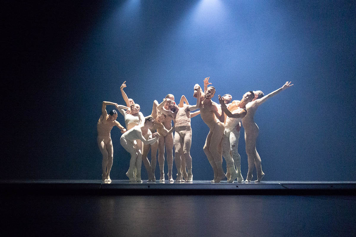
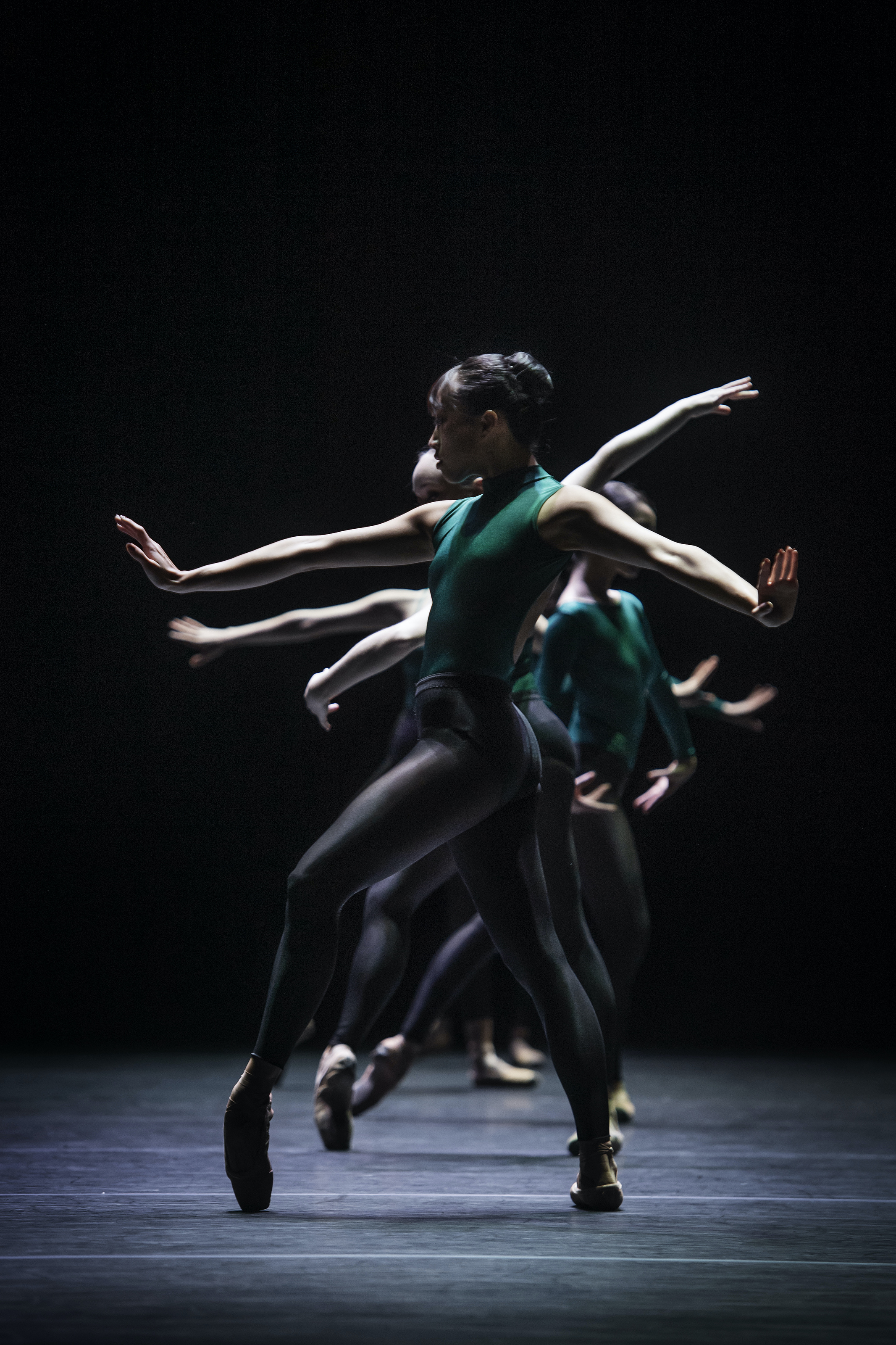
Sharon Eyal’s Saaba. This was spellbinding and awesome. It was as if she had seen the first piece and taken the best parts of the concept – minimalism, gradual change, waves of movement – and added emotional depth and vision, turned up the intensity to 11, and fixed all the niggling little shortcomings.

Like Kites, there is a minimalism to the choreography. There are rarely any large movements or radical changes. Unlike in Kites, everything always subtly mutating. It’s never just time passing. The group is constantly changing direction, or size, or motion, or role. In technical terms, the information density of this work is ten times that of Kites.

The style felt immediately familiar from the last time I saw a work by Sharon Eyal. The dancers move as a group, but their movements are not identical. There is always some deviation, someone going against the flow, or standing on their toes when the others have their feet flat on the ground, or looking left when the others look right.

What was most interesting about the choreography was the tension between the strict and the grotesque. Straight legs, controlled bodies, restrained movement, tightly braided hair – but also hunched shoulders, choked throats, pointed fingers, gaping mouths, distant gazes, pained grimaces. I got the impression of something demonic and obsessed, though it was far from wild or fiery. Possessed, otherworldly, especially with the dreamlike lighting making everything look slightly unreal.

And those amazing costumes of tight light-coloured lace, looking gritty rather than pretty, highlighting every movement.

Hypnotic, powerful, mesmerizing. I barely blinked during this performance, so as not to miss a single detail.


We saw the Hallwyl House Museum’s exhibition of Lego houses. It was smallish, and very much a mixed bag. The houses ranged from a construction of (literally) 15 Duplo blocks plus a propeller, done by a 5-year-old in 5 minutes, to intricate artistic creations and meticulously crafted large-scale community builds.

We were somewhat disappointed in how the constructions were presented. Almost all were surprisingly badly lit – either not lit at all, or only lit by a large light from above. Without Eric’s little pocket LED torch we would have missed out on a lot of detail, especially on the inside of the buildings. The one exception was a model of a museum, built by someone who (unsurprisingly) worked a day job as a museum photographer.

It was interesting to see the different scales used by different builds. There’s the minifigure scale, whereby a standard Lego minifigure is the size of a human. But there were also builds using much smaller scales (which I now know are called microscale), and one of the churches was scaled specifically to 1:100.

I’m always struck by the creative uses that Lego model constructors find for bricks, especially for architectural details. Scorpions become gargoyles; the butt of a Lego poodle looks like a marble bust; croissants get to play the role of baroque curlicues; fences become lattices for stained glass windows.

On long drives along straight roads with nothing interesting to look at, I like listening to music to avoid zoning out. Radio is the first, obvious solution, and I’m willing to listen to boring pop music while driving that I wouldn’t choose at home, but the long ad breaks get really annoying. So now it’s Spotify through a Bluetooth speaker that we bought especially for the car. (And that lives in the car and stays in the car and doesn’t get borrowed for any reason, because that’s how its predecessor vanished.)

There’s plenty of music that sounds good at home but doesn’t work in the car. Some frequencies become inaudible, while others sound unpleasantly sharp. Guitar-dominated rock music is right out. Drums and vocals work well, so sometimes I’ve picked some random Latino or afro playlist from Spotify. On this trip I realized that musicals and Disney movie soundtracks work great. We got through the entirety of the original Broadway recording of Hamilton on our way from Tartu to Tallinn to Stockholm. (Followed by the soundtracks for Moana and Encanto on the back and forth trip to Uppsala to drop off my brother.)

Hamilton is still as awesome as ever. Seeing it live in London was an incredible experience, but even hearing it through a pint-sized Bluetooth speaker while driving sends shivers down my spine. Ingenious rhymes, catchy melodies, great voices, punchy delivery. I’m starting to think of maybe going back to see it live again.

Danse Macabre at Kulturhuset. A mixture of theatre, dance and circus.

This was the weirdest thing I’ve seen in a long time.

The scene was covered in garbage. At the rear, a large construction consisting of a steep hill of sorts, and a box/room/house balancing on top of it. The box/room/house was often but not always tilting quite steeply left and right at a constant pace.

On the plus side, three of the people on the scene were really skilled as both actors, dancers and acrobats (and one of them as a singer). The fourth one seemed to be a bit of a filler, with not much to do and not much skill either – later I found out he was the director. I guess he wanted to stand on the scene, too.

The performance itself was a jumbled mixture of all imaginable things. I couldn’t discern any consistent theme or tone. It was so wildly inconsistent that the surprises stopped being surprising and interesting and just made me roll my eyes. It was as if the director/choreographer had just thrown in everything he could think of. Childish, and not in the sense of unbridled creativity, but more like “look at me being all crazy, now you all have to laugh at me”. And most of these fancies were abandoned soon after their introduction. Nothing actually went anywhere.

“Let’s put the dancers in a tilting box and let them hang off the walls! Let’s give the old guy a silly voice like a whiny kid! Let’s pretend he doesn’t know how to put on a shoe! Let’s make the long-haired actors hang their hair in front of their faces so we can’t see them! Let’s make the guy sing! Let’s make the guy give birth to a bundle of clothes, with really realistic groans and screams! Let’s have the small girl get inside an XXL hoodie and put the wrong body part out of the wrong opening! Let’s give the skeleton guy a pair of fake legs to hold so it looks like he has four legs! Let’s make them all stuff garbage inside their clothes! Look at us being so funny and unpredictable!”

I was yawning by the end of it, and so were the people next to me. At the end, the cast were clapping their hands to pull more applause out of the not-very-impressed audience.

The two parts that I actually appreciated were Dimitri Jourde’s singing, and the dancing inside the tilting box, which contained both actual development and progression and plenty of skill.


I actually had a wish list for Christmas this year, with a single thing on it: I wished for Ingrid to paint a picture for me.

We have two large emptyish walls, and I’ve never found any picture that I’ve felt strongly enough about to want to put there. I was thinking of ordering a Chinese reproduction of some famous painting, and even had an actual shortlist. Then I realized that I have an artist right here in the house, who could make an original work for me, which would be so much more special. Ingrid kindly obliged. I couldn’t be happier with the result.

The wall had been empty for years. Now that there is one painting there, it’s kind of asking for more, isn’t it? Perhaps I can wish for another painting for my birthday.

I saw this dance performance together with Eric already several weeks ago. Jotting down my notes here for future me before the impressions fade too far away.

Six independent duets by six different choreographers. The whole thing was supposed to be performed in Oslo but there was some sort of strike there so it was moved to Stockholm with short notice. Lucky us to get tickets.

1. Sasha Waltz, Impromptus. Male/female. Technically beautiful but not very interesting. Lovely piano music by Schubert.

2. Emma Portner, Islands. Female/female, with the two dancers wearing a single set of four-legged loose trousers. They moved sometimes like twins, sometimes like mirror images, and sometimes my brain literally interpreted them as a single body with an unclear number of legs and arms. Very cool. Somewhat disappointing that they disconnected from each other towards the end.

3. Mats Ek, Julia & Romeo. Male/female. An excerpt from a longer narrative ballet. Energetic and playful and loving, but it felt a bit misplaced without the rest of the story.

4. Chrystal Pite, Animation. Male/female. The man’s movements start out broken, as if he doesn’t have full control over his body. The woman supports and guides. (Even so I clearly felt that he is the main dancer, not she.) As time passes, he becomes more “normal” and his body more “whole”. Something something love heals all ills? Too bad, because I found this message rather clichéd and his normal movements towards the end much less interesting.

5. Jiří Kylián, 14’20”. Male/female. I have no particular memories of this piece.

6. Ohad Naharin, B/Olero. Female/female. Bold, angular, energetic, cool. Great finale for the evening.

Photo credits: Islands © unknown because the page has been removed from www.operan.no; I got the photo from Google’s cache. Animation © Eric Berg.

A ballet evening in three parts.

Jiří Kylián, Bella Figura. Lovely baroque music, but I never quite managed to connect to the dance. The movements were too intellectual, too artificial. I couldn’t relate. It was as if each movement was a signifier of something important but unknown, but they made no sense without knowing the significance of each one.

Mats Ek, överbord (woman with water). Seen it before, and it was as striking and compelling as last time. A woman and a table and a glass of water, and it is as if she is meeting both of them for the first time.

There was also a man, but he felt almost like an afterthought. He flitted through, dressed in a black suit, poured water for the woman, but didn’t feel like a part of anything. I see from the photos that he was there last time as well – I had completely forgotten him and even thought he was a new addition in today’s version of this piece.

Forsythe, In the middle, somewhat elevated. About ten dancers in green and black. Their movements and poses are classically strict and very athletic. Groups emerge, cohere and dissolve, merge and move apart. Mesmerizing and utterly compelling.

All photos (c) Kungliga Operan/Carl Thorborg.