I’ve been aware of Stockholm Craft Week for a few years, and this year got around to visiting some of its activities for the first time.

Kapsylen is a co-owned/co-op space for craftspeople, located in a building that used to house a bottle cap factory (hence the name). During Craft Week they open up some of their spaces for the public to visit. Some of the rooms housed a small exhibition; others were actual workshops.

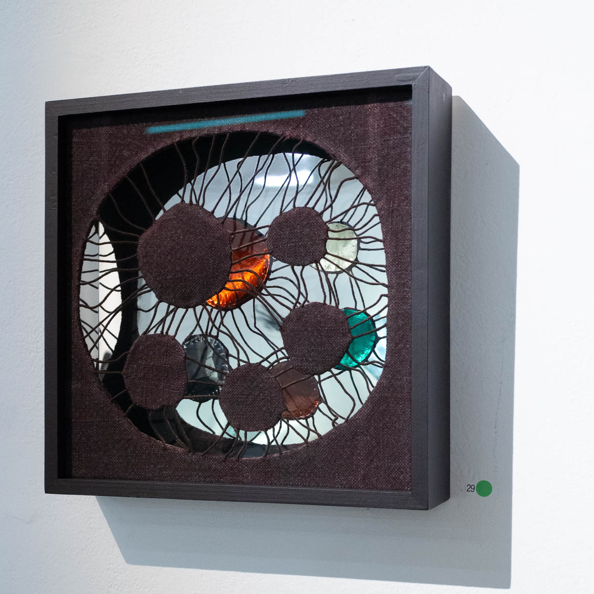
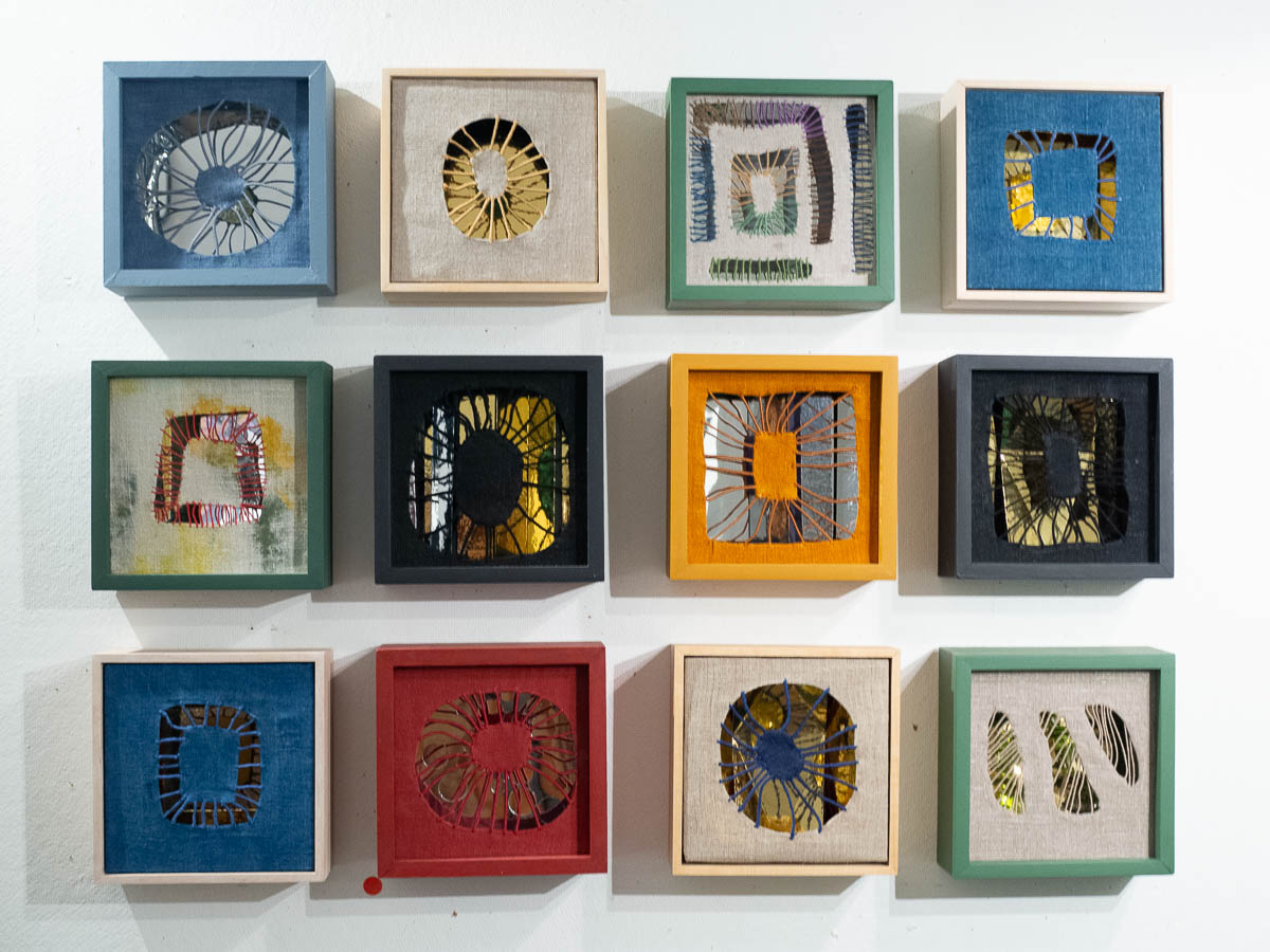
Ingela Friedner had made a series of boxes with a textile layer at the front and a reflective surface at the back, which then reflected the otherwise hidden reverse of the textile layer. Simple but ingenious.

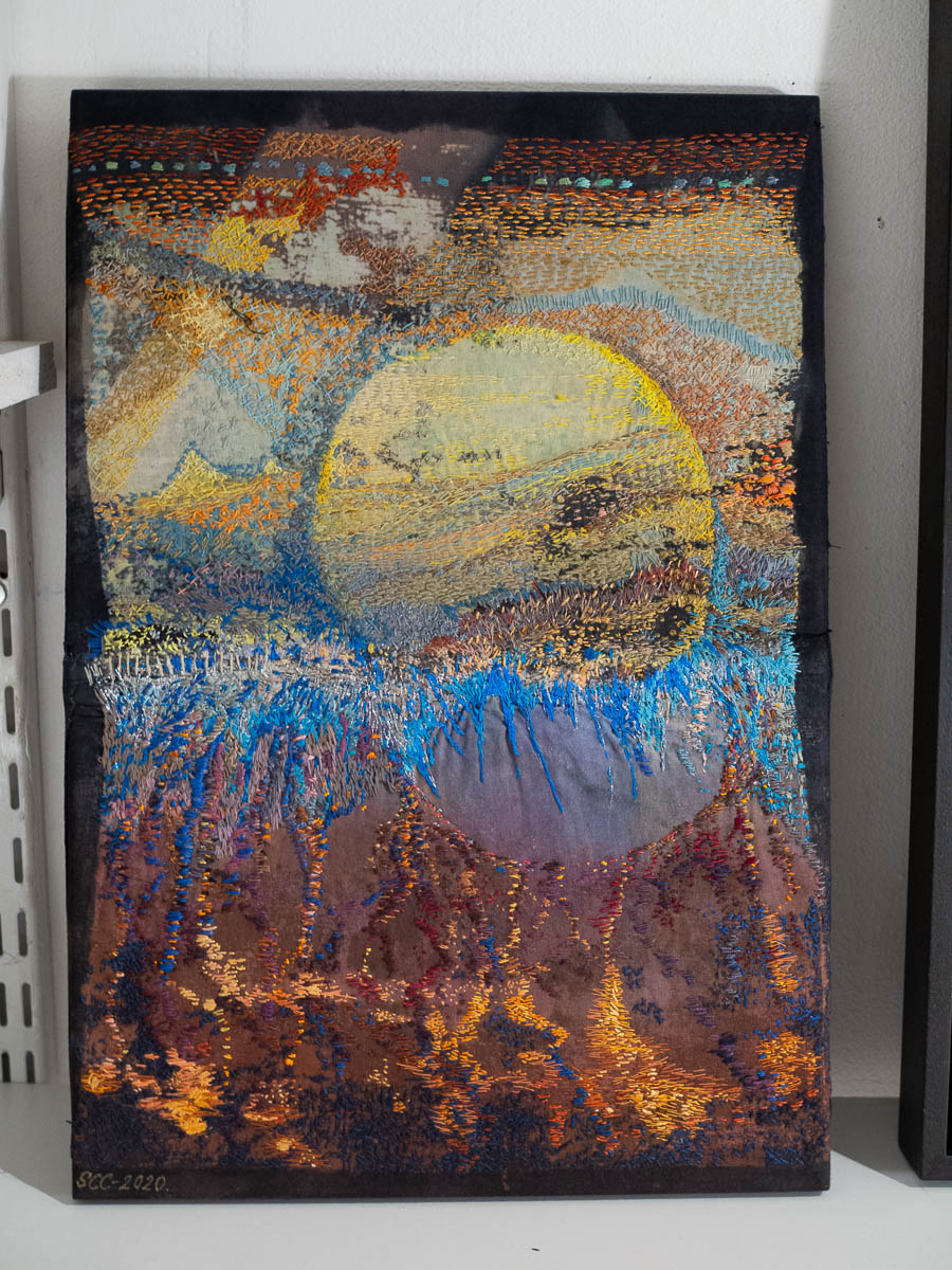
Sara Casten Carlberg embroiders intricate fantasy landscapes on painted and printed fabric.

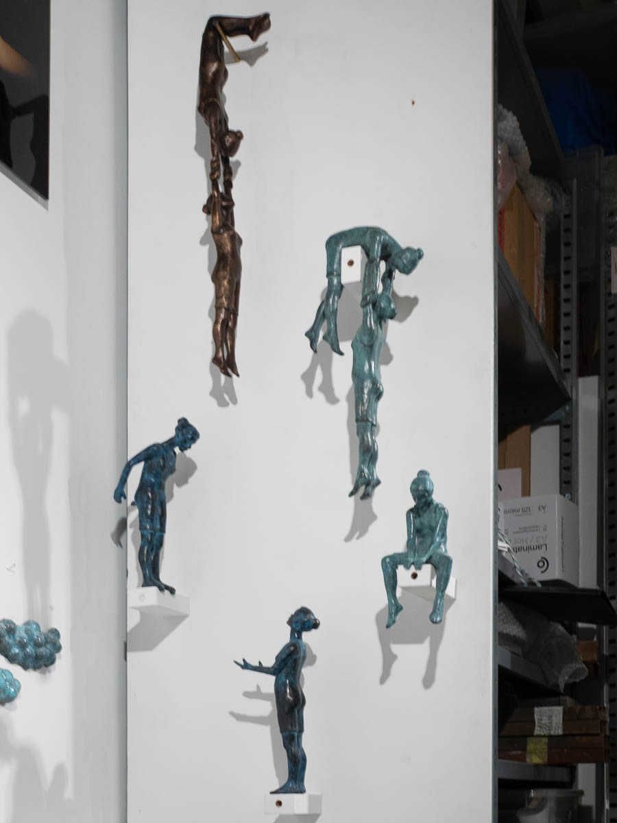
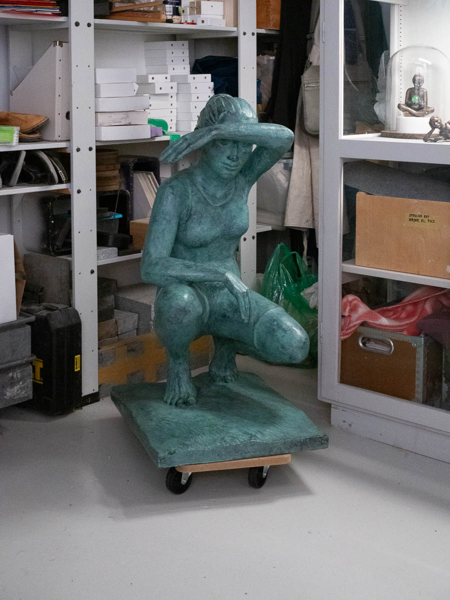
Lovely sculptures of gymnasts in the workshop of Eva Larsson.


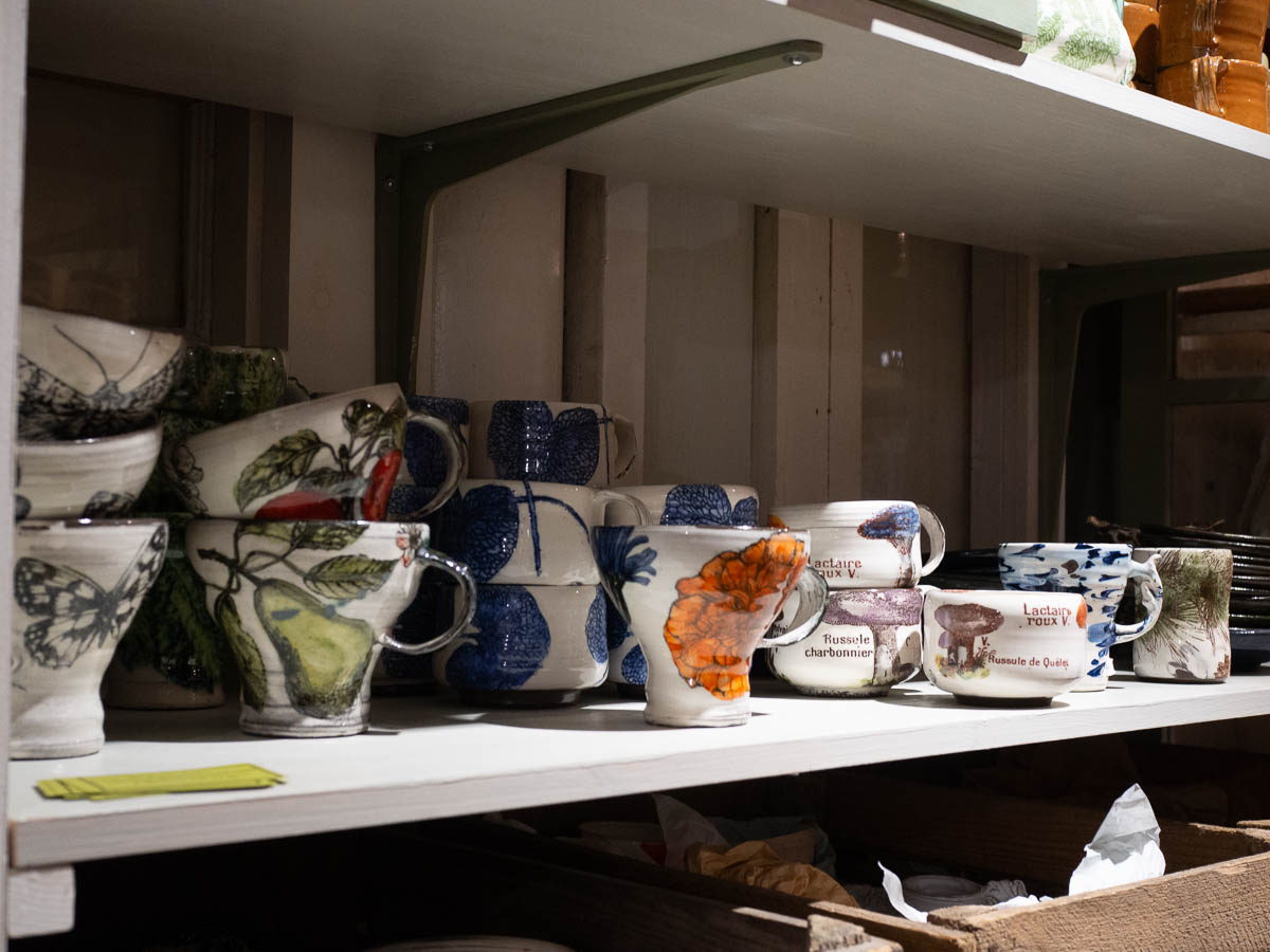
Elisabeth Ottebring was at work in her ceramics workshop, despite the late hour. I learned that most ceramics clay these days is synthetic because there isn’t much natural clay left.

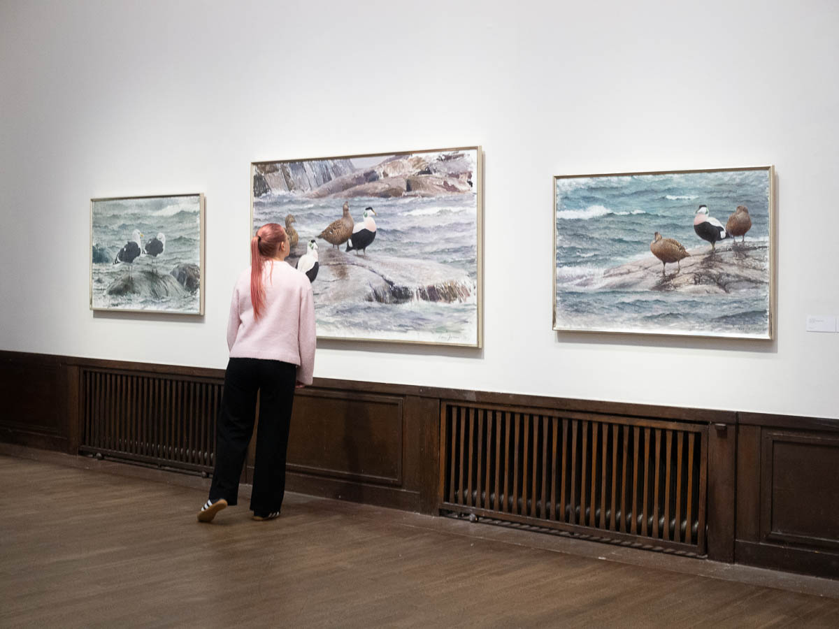
Ingrid and I went to see an exhibition of Lars Jonsson’s drawings and paintings of birds at Liljevalchs.

Exceeded all expectations. We were truly blown away.

Lars Jonsson is an artist and an ornithologist who makes incredibly life-like pictures of birds. Not primarily photorealistic, although some are, but better: where the painting captures not just the typical physical appearance of a species, but also its character and behaviour, and the details of the individual specimen, and the atmosphere of the situation. Some birds in flight are intentionally blurred at the edges; some are captured at an odd angle.

He makes all his sketches and most watercolour paintings out in nature, drawing from life. His birds are not smoothed-out averages but unique individuals.

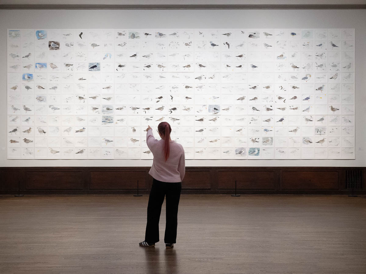
There is literally a wall with just hundreds of sketches of gulls. Some of them are multiple sketches in one: a sheet of paper with just beaks, or with several variations of the striation on their sides.

And you think: he’s able to produce this amazing work because of the decades of practice he’s put in. But then you see that even his early paintings, over forty years old by now, are amazing.

An incredible dedication; almost an obsession. After 50 years of drawing sea birds, how does he not get tired? How can he still see something new in each bird that is worth capturing?

Seeing this exhibition on a weekday evening after work was perfect. Much of the time it was just the two of us; in total I think we saw three or four other pairs of people pass. Large, calm paintings of sea birds, softly lit, in large, quiet rooms – very tranquil. Nobody passing behind us – or in front of us – when we’re backing up to take in a large painting.

If you’re in Stockholm, the exhibition is open for another 10 days, until October 12th. Very much recommended.

Lars Wallin Atelier – 35 Years of Fashion Stories at Artipelag.

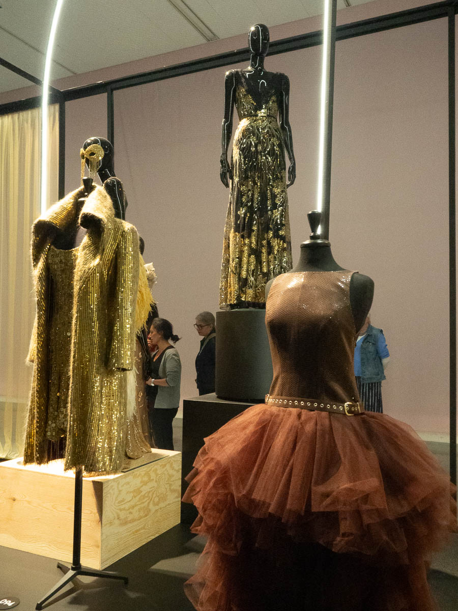
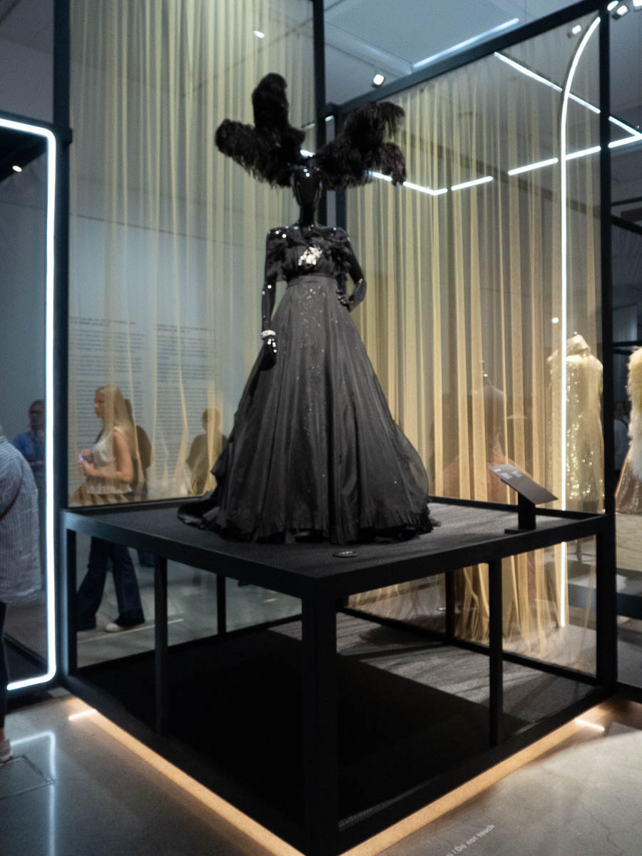
Lars Wallin is a Swedish fashion designer who mostly designs unique dresses for celebrities, royalty, and presenters of shows such as Eurovision. Artipelag exhibits dresses that Lars Wallin has created for various people and now asked to borrow from the owners for this show.

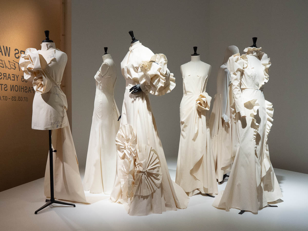
There was an introductory section with sketches and toiles, and some background info about Lars Wallin and his approach to design.

The rest of the exhibition rooms were dedicated to showcasing the dresses.

It all looked very shiny, but that was about it. I had been hoping for more. Insight into his creative process, for example, or how the dresses had been designed or made. Now it was just “dress made for this and this for the Cannes film festival” or “dress worn by this and this at the Melodifestivalen final 1994”. After a few signs like that, I just stopped reading them.

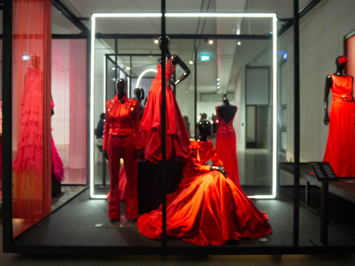
The dresses were also, frankly, kind of boring. I’m sure that the wearer felt glamorous, and Lars Wallin probably had fun designing them, but there was nothing interesting about them. Nothing that made me think “oh that’s clever” or “wow, I hadn’t realized you could do that”. No, it was just “wow, that’s a lot of sequins” and “well, that sure is very red” and even more “that looks expensive”.

This last photo of the red section is out of focus but it gets to be here anyway because it really illustrates my thoughts so well. When he makes a red dress, he makes it the reddest red, and that’s it. The next dress is equally red. There is no nuance, no subtlety. Just a lot of sameness.

This is the last weekend of an exhibition at Artipelag that I wanted to see.

Last time I was there, I took the car. Today I was carless because I’d – somewhat carelessly – promised to lend the car to someone else, not giving much thought to how I’d take myself to Artipelag. Surely there are buses or something.

There are indeed buses, but getting there by public transport turned out to require a train and then three separate buses, for a total travel time of around two hours. Or… I could cycle there, and it would only take twenty minutes longer. There and back would be a full day’s worth of cycling, so why not make a day of it. Could I spend the day in a better way? Indeed I could not.

The first bit was just getting from Spånga to central Stockholm, which was just like biking to work. After that I cycled along paths that I’ve never passed before, through parts of the city that I’ve never seen up close. A nice bit of sight-seeing, which I rarely do in Stockholm.
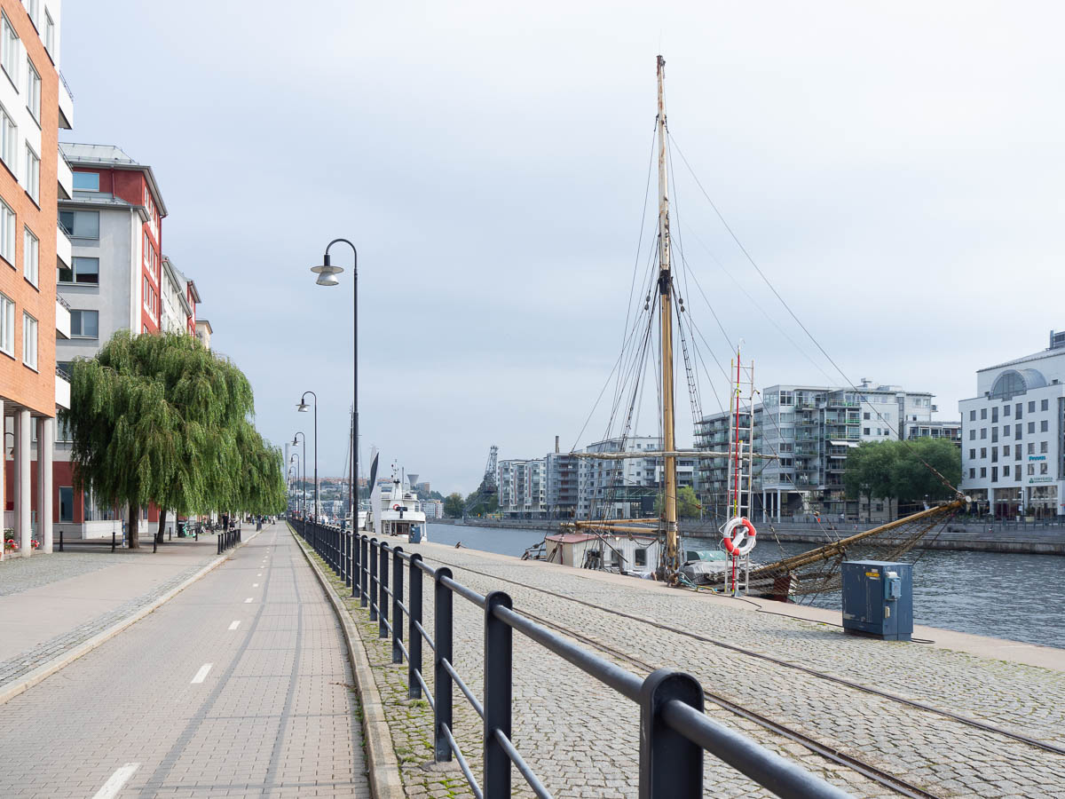
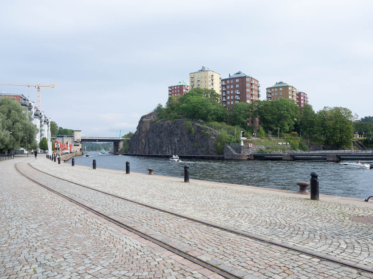
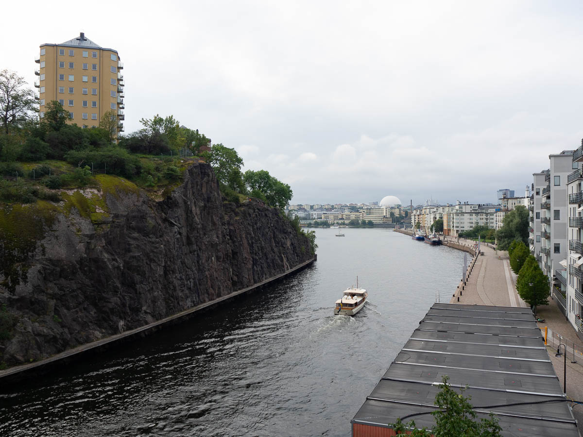
Some of those stretches through central(ish) Stockholm were rather crowded with Saturday morning joggers and dog-walkers, and it was a relief to leave them behind. The cycle paths through Nacka and Sickla were even more stressful with roadworks and blockages everywhere – so confusing in places that I struggled to even find the cycle path, and a car driver, conversely, ended up on a cycle path by mistake.

Once I got through that, there was a long and easy stretch of good cycle paths along Värmdöleden, a main road or small highway. Large and long enough to give me a good, steady road to follow, with no map-reading necessary, but still local enough to be free of heavy traffic, at least on a Saturday.
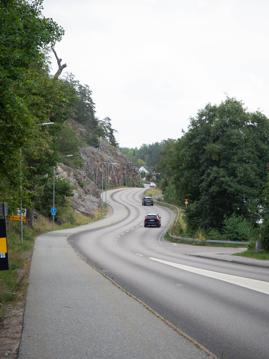
The further I cycled, the more rural the road got. Near Gustavsberg the cycle path left the main road and got onto smaller tracks and roads.
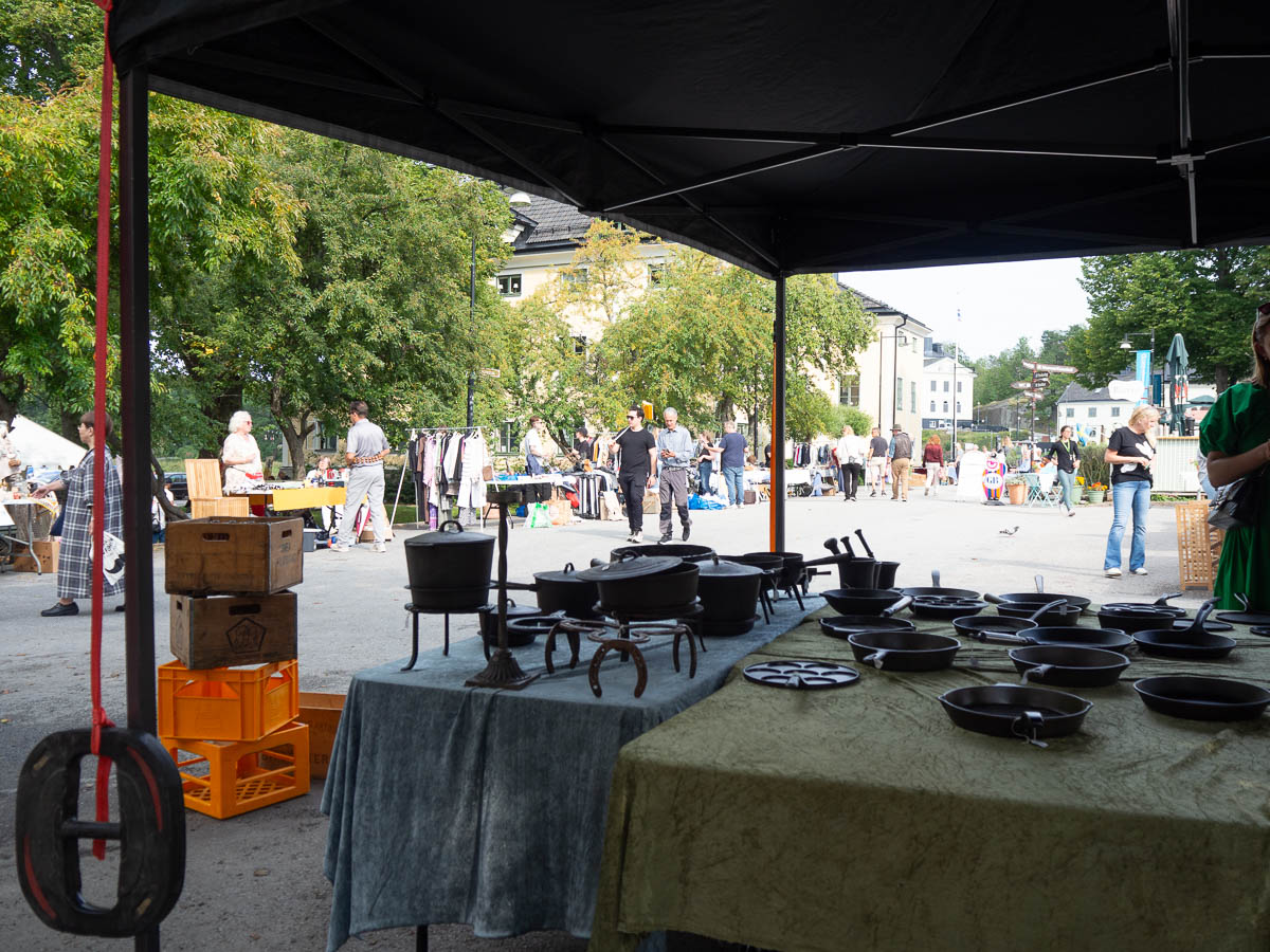
In Gustavsberg I ran across a flea market. I browsed around without much hope of finding anything, mostly to take a break. Most flea markets are full of cheap clothes and boring glass and ceramics. Here, though, I found a whole market stand full of cast iron pots and pans! I’ve become more and more fond of cast iron cookware recently and added more to my cupboard. They’re expensive, so I’ve been on the lookout for good used ones. I found a good-quality small pan here, exactly what I needed.
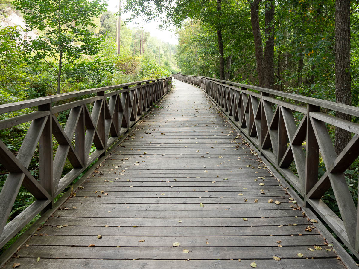
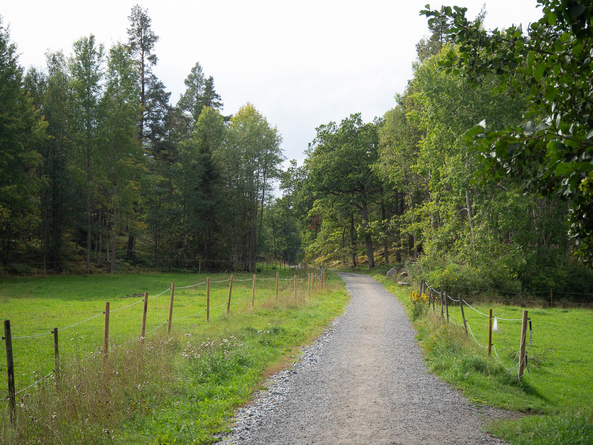
For the last bit after Gustavsberg, I was cycling on forest paths and small local tracks.
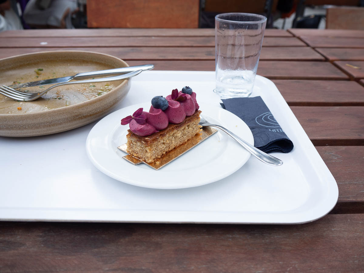
With all the water breaks and map-reading, it took me closer to three hours to reach Artipelag, and I was quite ready for lunch by that time. Artipelag has both a restaurant and a café. The latter served excellent lunch at very reasonable prices. And cake! It felt a little bit like I was cheating on Spånga Konditori by eating fancy cake elsewhere.
I’ll have to make a separate post about the exhibition because this is long enough already.

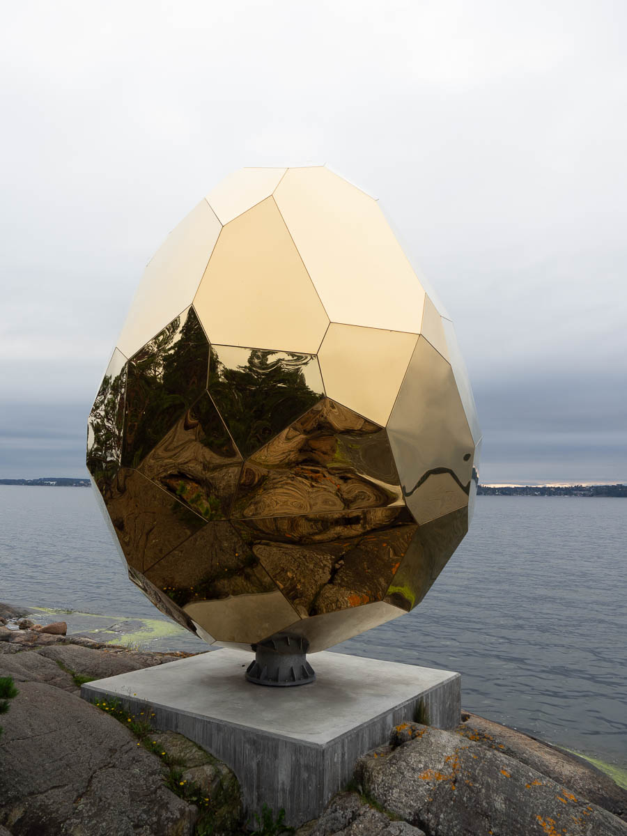
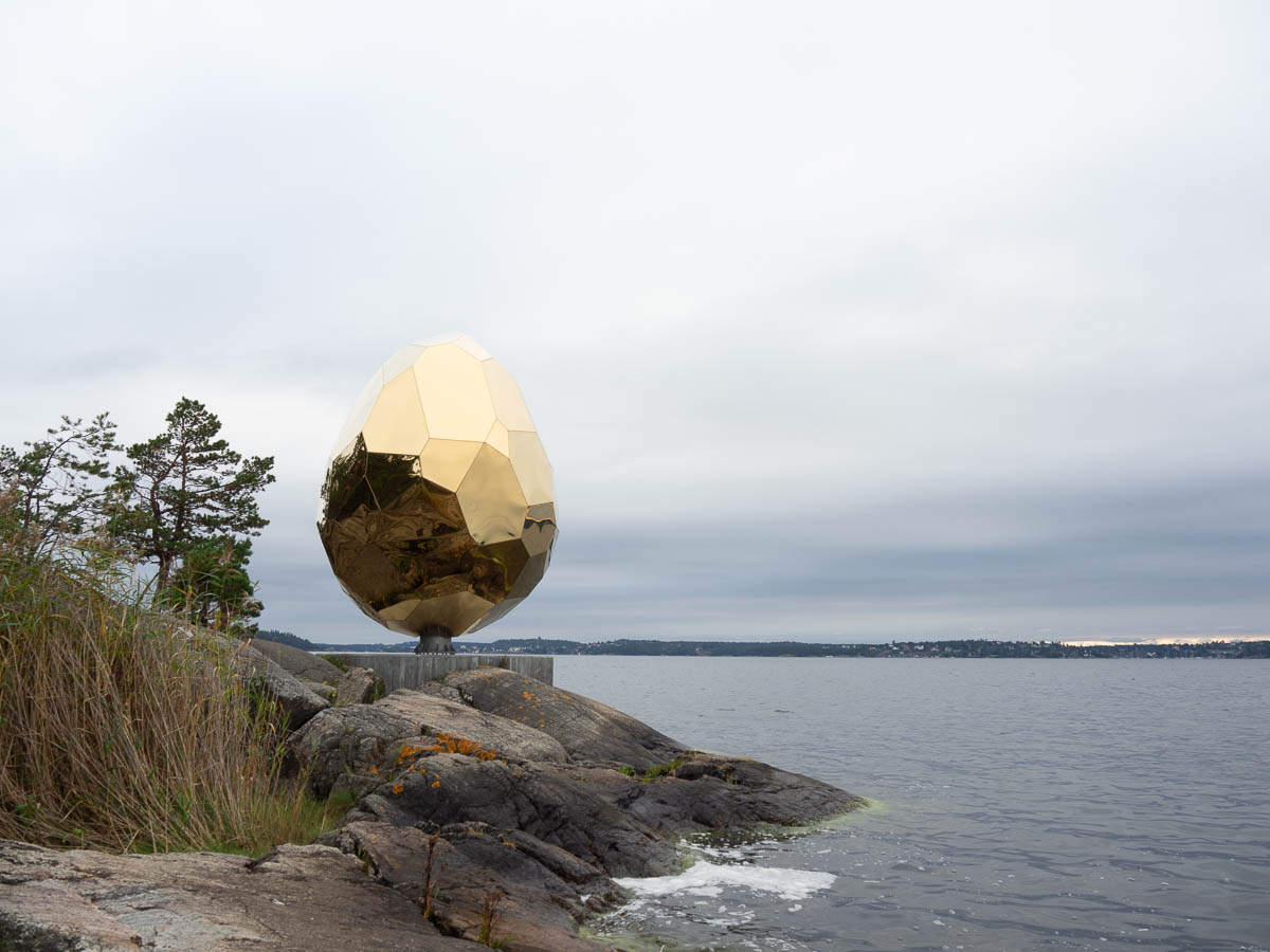
Afterwards I took a short walk around the grounds to see bits of the outdoor sculpture exhibition. Mostly not very exciting… but I loved the Solar Egg. It was originally commissioned for Kiruna in conjunction with the town being moved, and apparently has a sauna inside. Here the sauna doesn’t seem to be open or functioning, so the egg is just a sculpture.

It’s a roughly egg-shaped irregular polyhedron, six metres tall, and it’s strikingly beautiful. More golden than gold, sunnier than the sun itself. Against a grey sky, it was like a revelation from another world. Stainless steel mirrors with titanium gold colour coating, according to the makers.
I didn’t stay around for too long, since I still had another 40 km of biking before I’d be home. After two thirds of the way, when I was in reach of the commuter train network, I briefly considered getting on a train with my bike. But the bit that was left was no more than my daily commute home, and that’s nothing, so I just kept going.
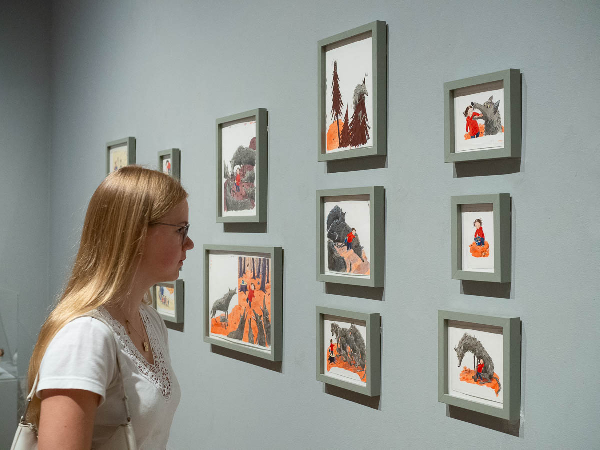
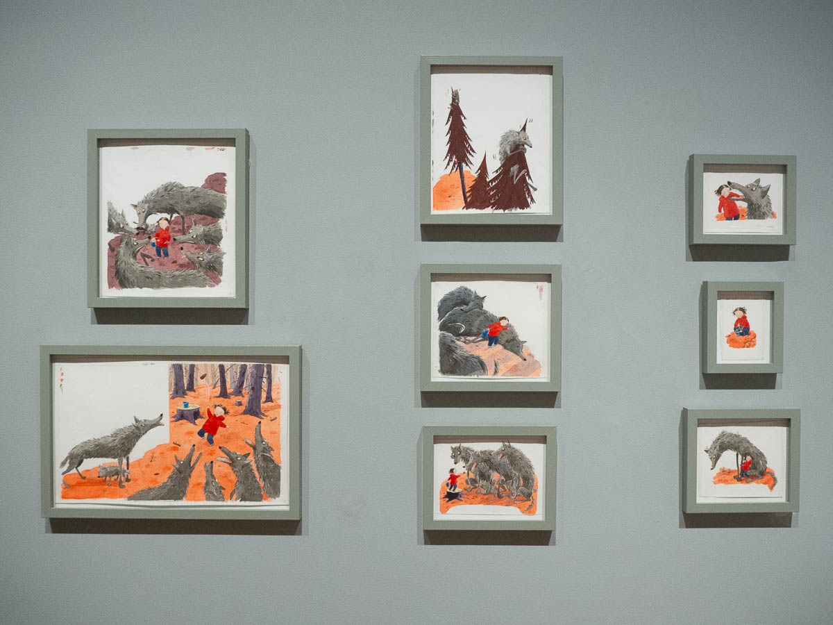
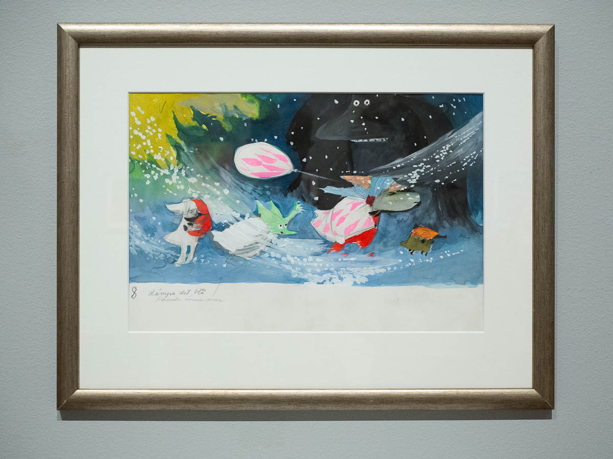
Ingrid and I saw an exhibition at Waldemarsudde with four popular Finnish/Swedish/Estonian illustrators of children’s books: Tove Jansson, Ilon Wikland, Pija Lindenbaum and Linda Bondestam.

Tove Jansson is, of course, the creator of the Moomin books, which I read already when I was a child. Ilon Wikland illustrated many of Astrid Lindgren’s books, many of which were also translated into Estonian already back in the 1980s. Back when the children were children, I read a lot of those books again together with them.

I’m not sure how well known Pija Lindenbaum is outside of Sweden, but she is very well-known here. She has been giving out at least one book a year since, like, 1990, and some of the best ones came out just as Ingrid was in the picture book age, so we read those over and over again.

Linda Bondestam became active more recently, after Ingrid and Adrian had outgrown picture books, so I hadn’t come into contact with her work before.

I loved this exhibition. There was lots of material, not just originals of the finished illustrations themselves (which were numerous) but also early sketches, notes, colour palettes, character studies, storyboards, etc. A fascinating look behind the scenes.

The illustrations themselves were interesting. Sometimes much smaller than I had thought (especially some Moomin drawings were tiny) and sometimes much larger (Linda Bondestam likes to work on a large scale).
Fascinating to see the tiny means by which a wolf’s eyes and snout can communicate its mood and feelings.

Seeing the pictures all like this, without any text and story to distract from them, highlighted the importance of layout. A normal picture utilises a canvas in whatever way it wants: sometimes all of it, sometimes just a part. But an illustration (at least in modern children’s books) takes text layout into account from the start. Sometimes leaving room for a lot of text, sometimes just a line or two. Sometimes stretching out to overlap with the text, or reaching out of its assigned area to play with space.

I was surprised to see how boldly Tove Jansson used colour in some of her works. In my mind the Moomin illustrations are black and white ink drawings, and where they are in colour (such as in Vem ska trösta Knyttet) it’s mostly plain fields of colour. But here were some very dynamic scenes.

Now I feel like re-reading all the Moomin books, and other works by Tove Jansson as well.

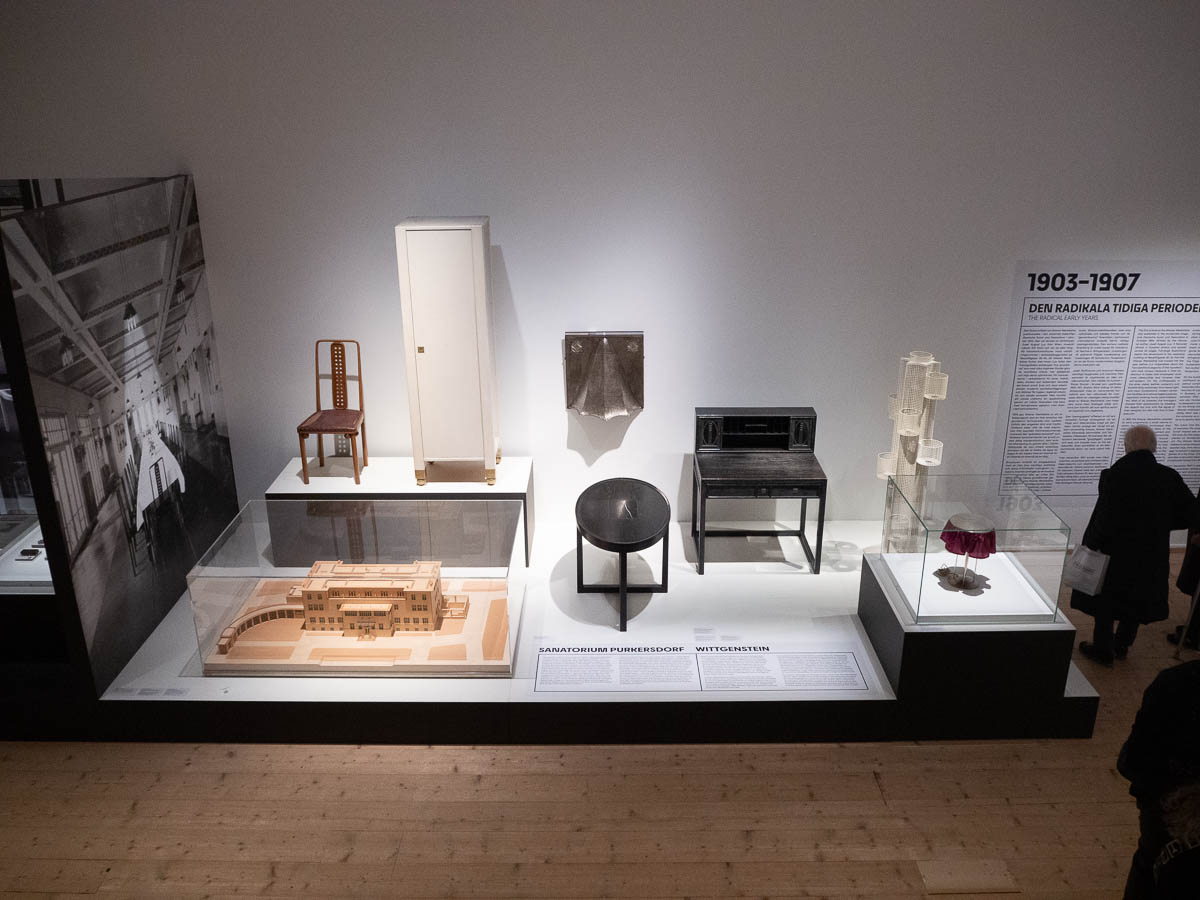
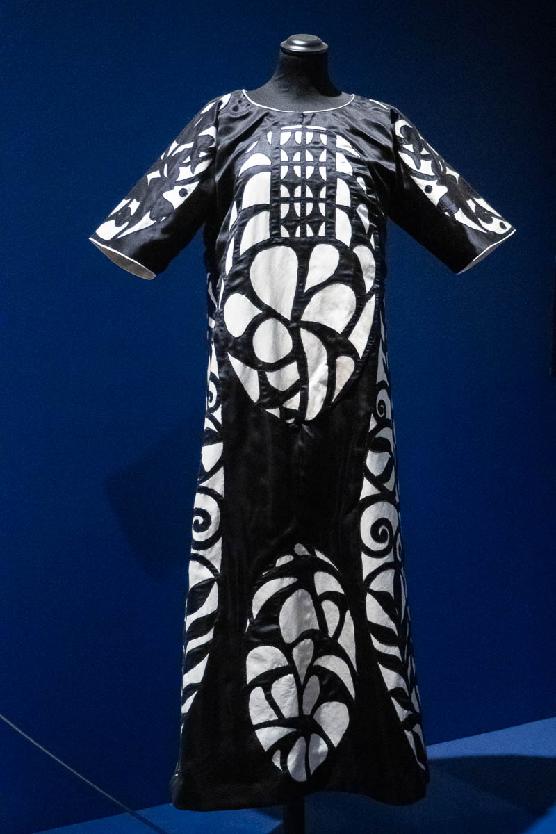
Went to see an exhibition of the work of Wiener Werkstätte, at Millesgården. (A workshop “dedicated to the artistic production of utilitarian items in a wide range of media, including metalwork, leatherwork, bookbinding, woodworking, ceramics, postcards and graphic art, and jewelry”, in Wien from 1903 to 1932.)

The exhibition was full of luxurious, beautiful objects, designed and made for a very different time. Their style must have felt radical back then. But I can see why they went bankrupt.

The story about the cooperative workshop and their ideology of Gesamtkunstwerk and raising design and craftsmanship to be equal with art was interesting. I couldn’t make sense of their actual design principles, though.
The first parts of the exhibition present them as valuing function strictly above ornamentation – furniture with pared-down lines, much black and white, logos and graphical design with pure geometric forms only.

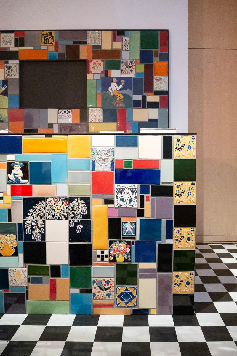
But then the bar of the Fledermaus cabaret – reconstructed in its full glory – is almost psychedelic in comparison.

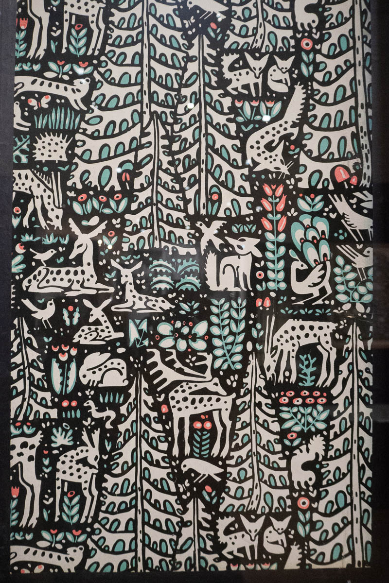
There’s an austere black-and-white masquerade gown, next to a wallpaper embroidery design that is all full of extra everything.
Pretty, but also confusing and thus somehow unsatisfying.
I’ve been thinking of seeing I Follow the Sun at Artipelag since the summer. Was hoping that Ingrid would find time to join me, but she’s been working at least one day every weekend, so I ended up going on my own.

This was my first time at Artipelag. With a new museum, you never know what you’ll get. I came fully prepared for a small provincial art show with a couple of big-name works padded out with unknowns, and was blow away by the whole exhibition. I’ve really been missing out!

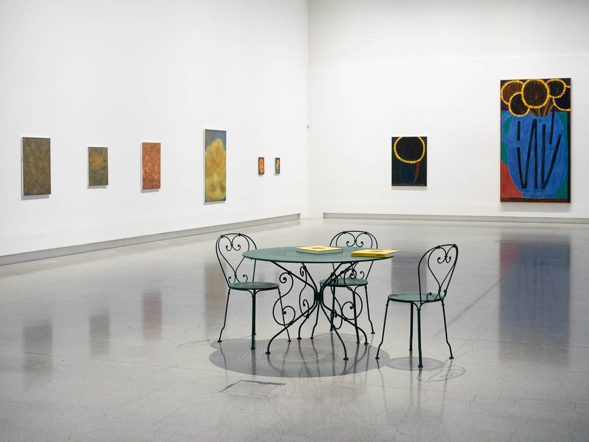
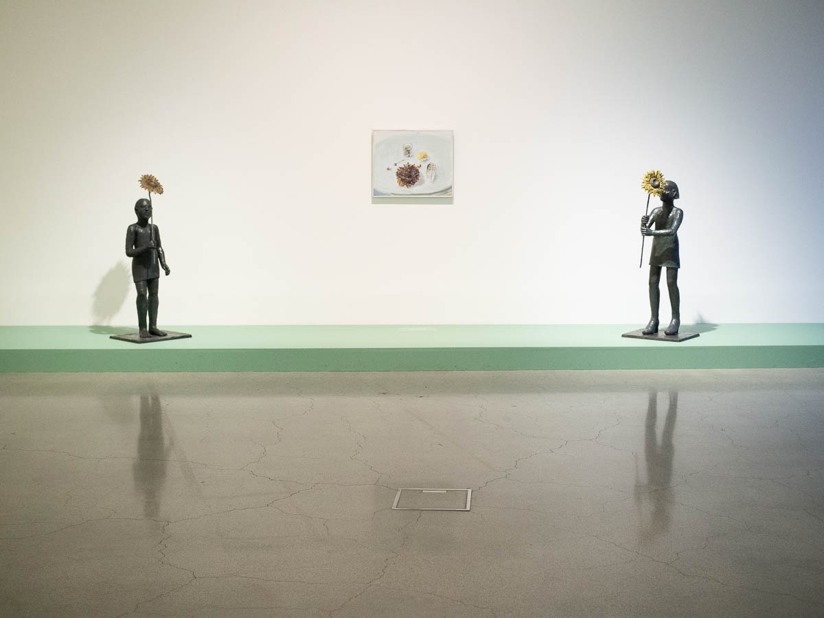
The exhibition was a lot larger than I had hoped for. There were works of Fernand Léger, Emil Nolde, Carl Larsson, Ai Weiwei, etc, and beautiful works of contemporary Nordic artists. No actual Van Goghs, which is understandable. I read in the book accompanying the exhibition that the concept for the exhibition had started years ago with the idea of borrowing Van Gogh’s paintings, but withered away when it turned out to be impossible. The museum staff pivoted and made something different happen instead.

But his paintings are the quintessential images of sunflowers, impossible to avoid. They’re on jigsaw puzzles, mouse pads, mugs, aprons, shopping bags, towels, and everything else you can imagine. I wonder what he would say about how his works have been used.

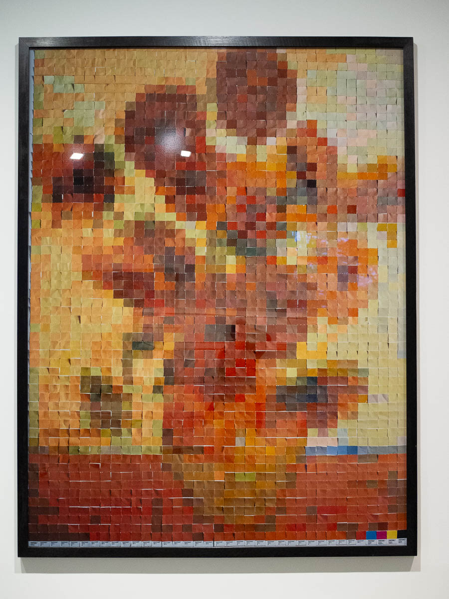
And he was here as well, in the shape of Vik Muniz’s works. He has recreated Van Gogh’s works with pieces of coloured paper. You’re looking at a digital copy of my photo of a print of a photo of a recreation of a painting. How many layers of indirection is that?

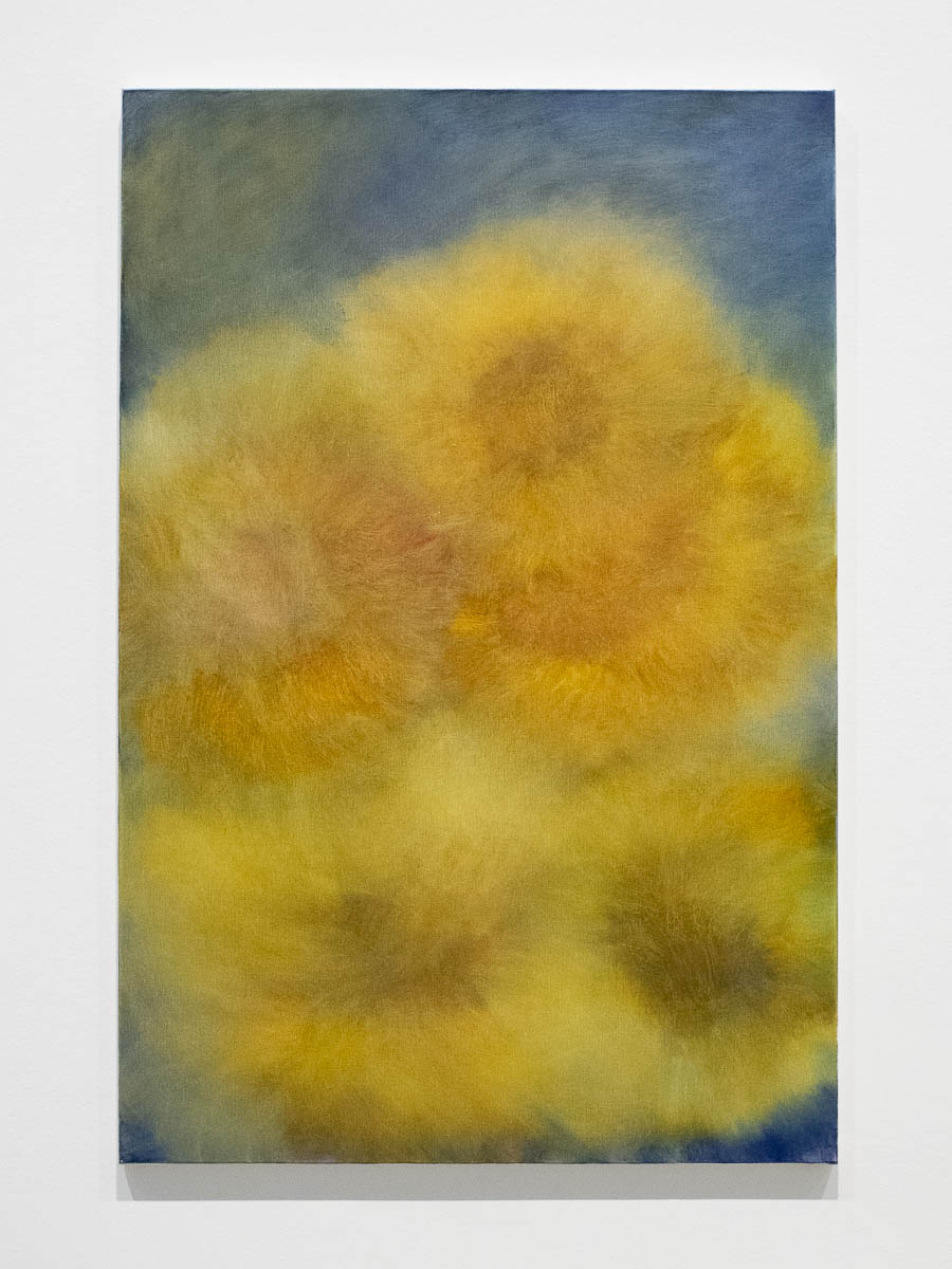
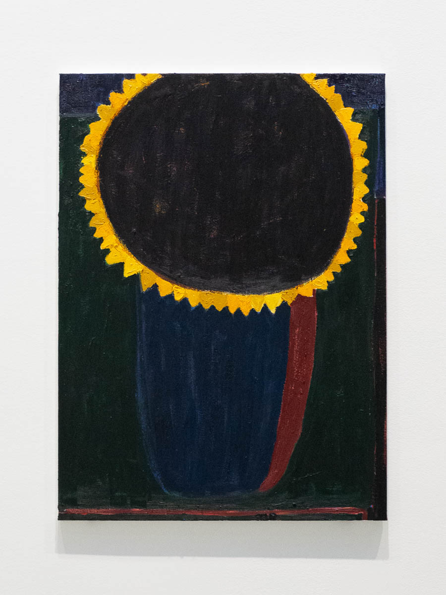
There were very soft, romantic sunflowers, and harsh, stylized sunflowers. (Clara Gesang-Gottoft and Tal R.)

There were works by artists who have made sunflowers their “thing”, and by others who have said that flowers are the worst thing you could possibly paint but then couldn’t help themselves after all.

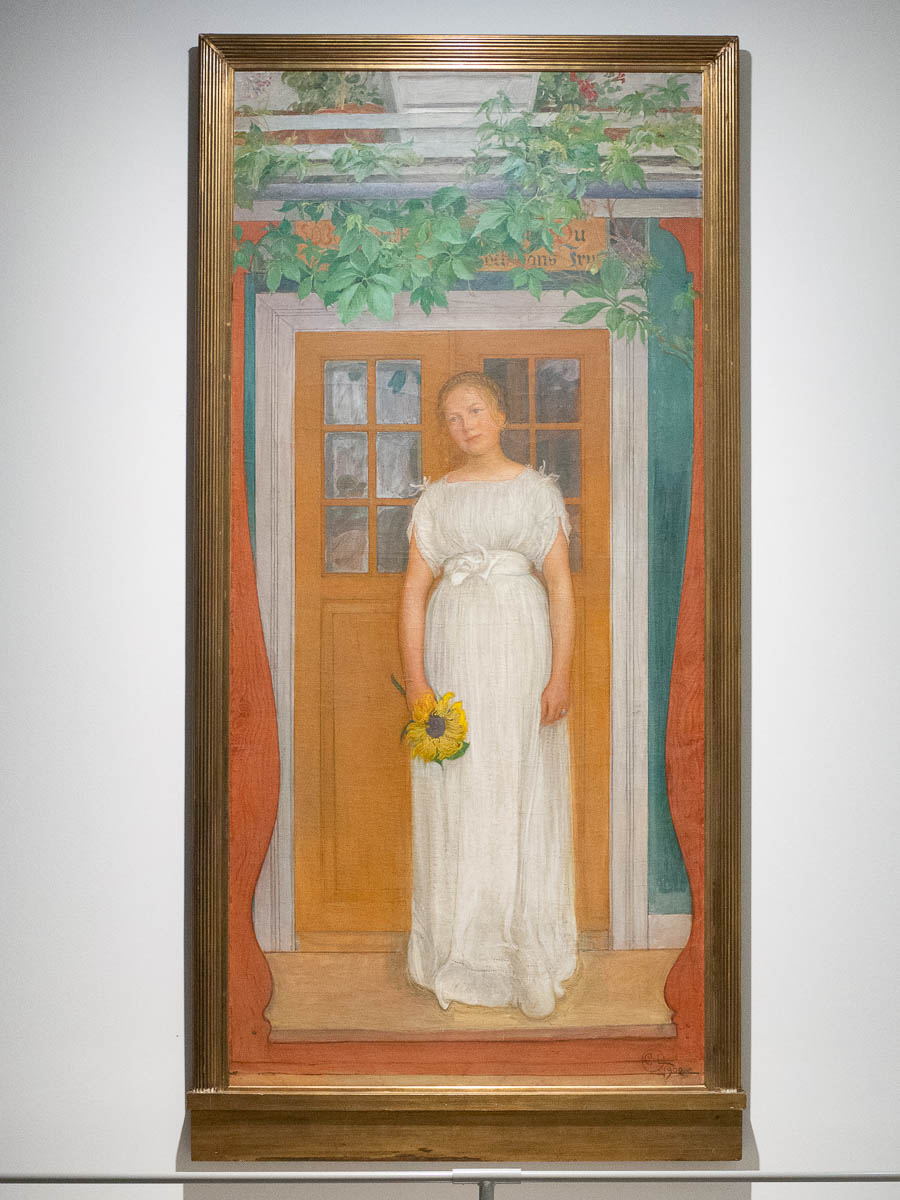
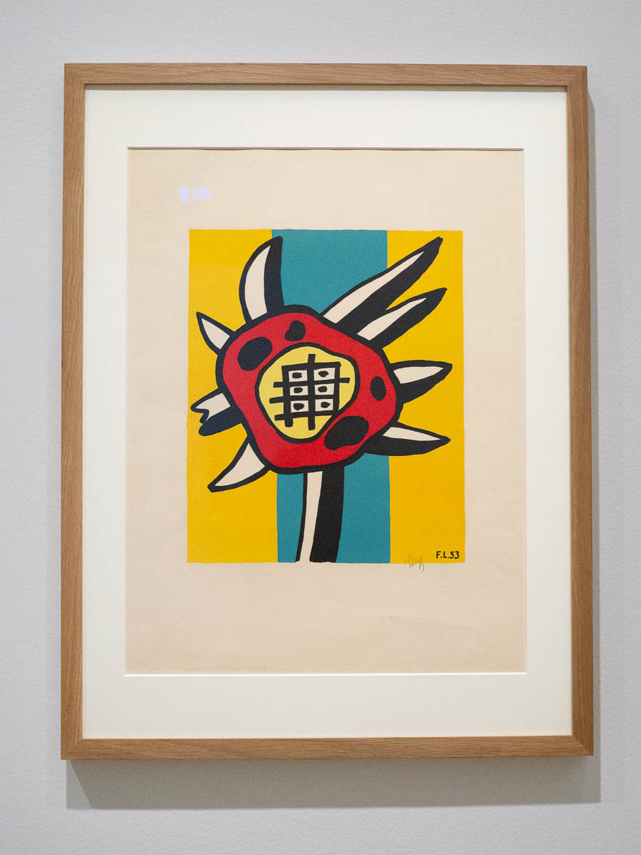
There were sunflowers carrying a heavy load of symbolism, and sunflowers reduced to abstract shapes. (Carl Larsson and Fernand Léger.)

There were colourist sunflowers and pointillist sunflowers and naïve sunflowers.

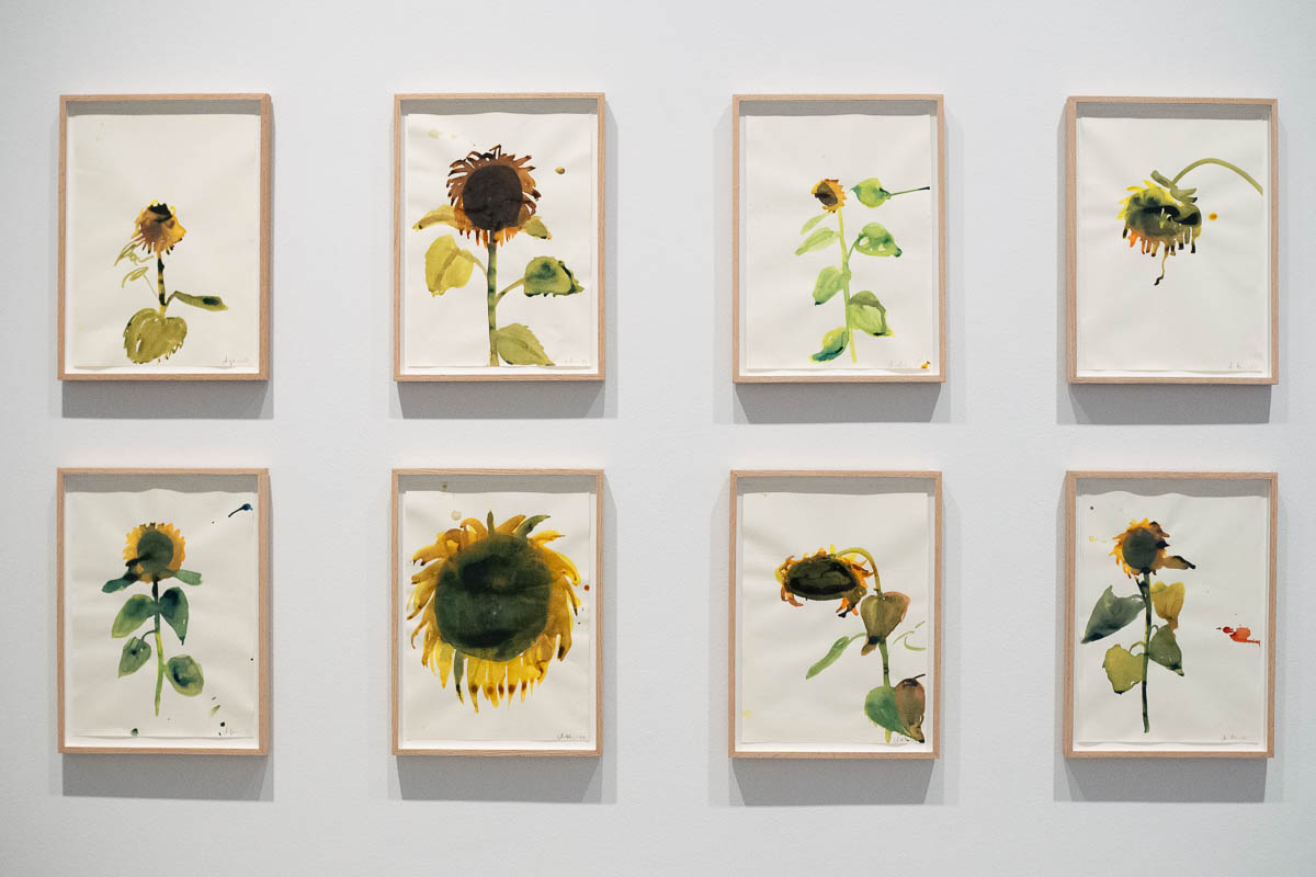
I loved these simple ink paintings by Anna Bjerger.

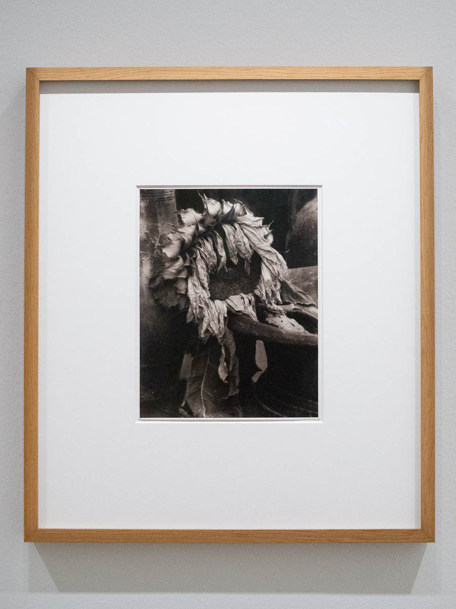
There were also photographs. What struck me about those was their timelessness. A photograph of a sunflower from 1920 is mostly indistinguishable from one taken in 2020.

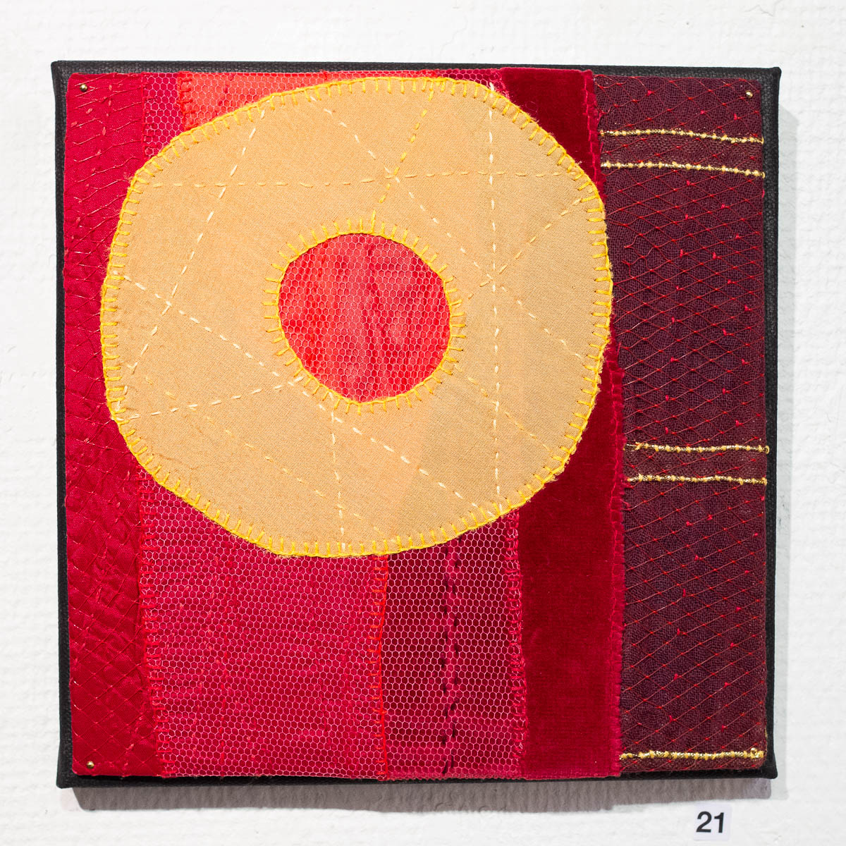
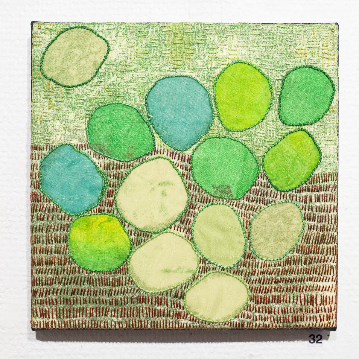
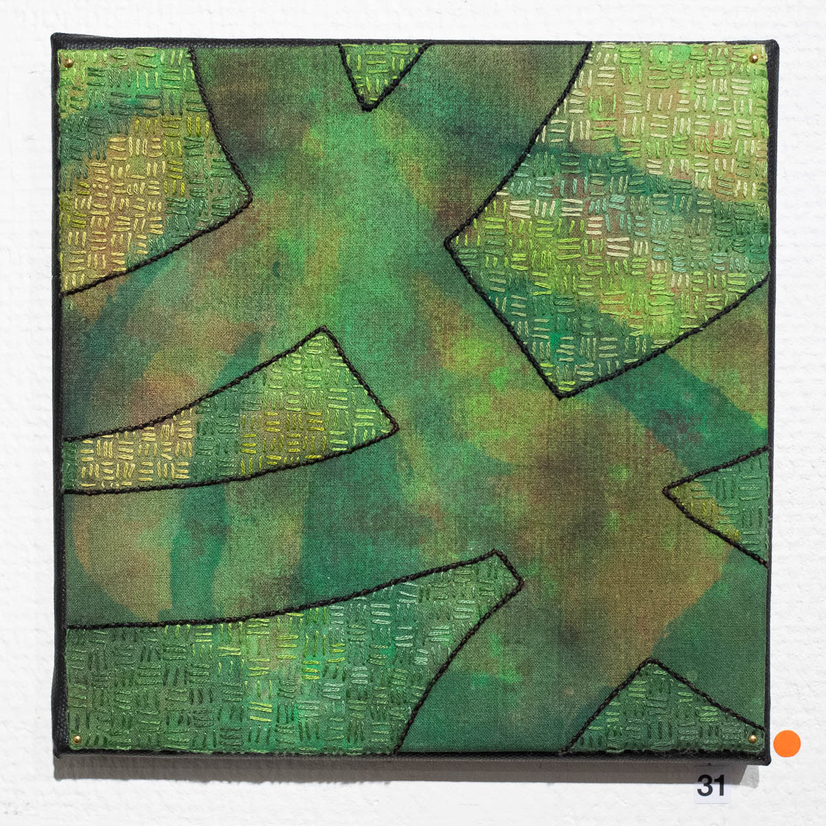
Visited an embroidery exhibition at Husby Gård community centre.

It’s so close to Spånga and so close to my interests but I had no idea it was there, until one of the other members of my Thursday embroidery club told me about it. Today was the last day of the exhibition, so the artist herself, Lena Larsson, was there.

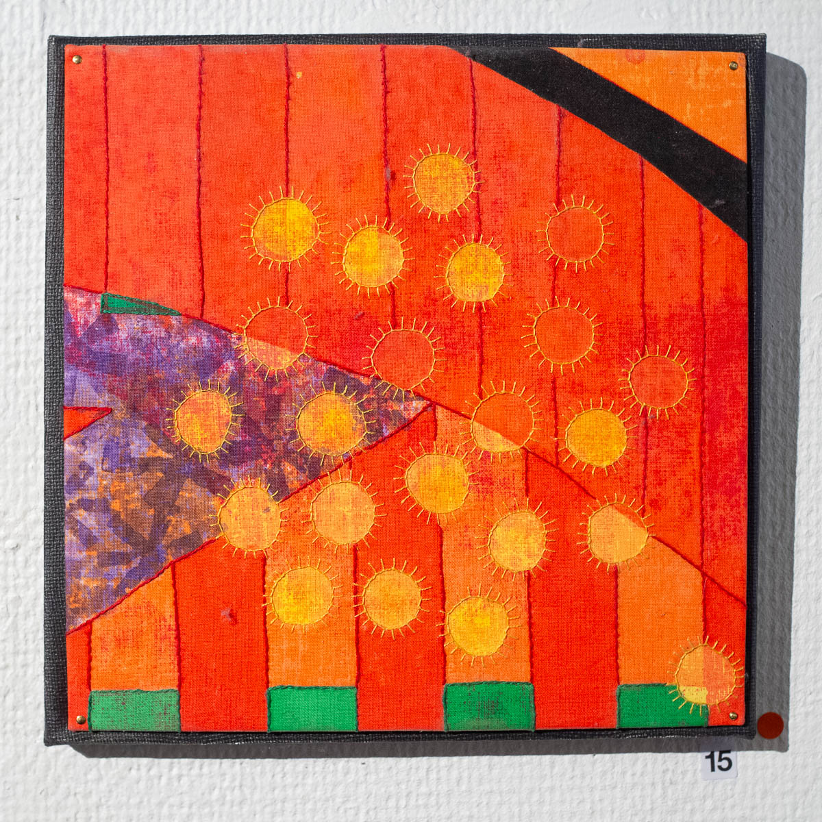
I liked her bold use of colour, and the way she layered fabrics for depth. And the shapes, simple but not strict. Also all the hand-printed fabrics.


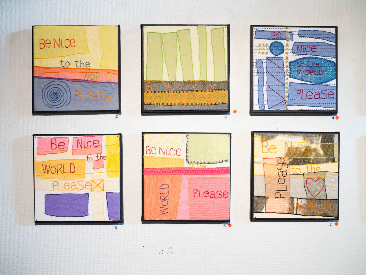
All her works (except one) at this exhibition were the same size, so it gave a very coherent impression. Most were grouped by colour theme – the red works, the green ones – and I wondered if she had planned them that way, but she said she’d made them without any such plan and grouped them afterwards.

There was one set of works that clearly had been made to belong together. I like the idea of realizing the same idea in multiple different, but coherent ways. I should do that myself.

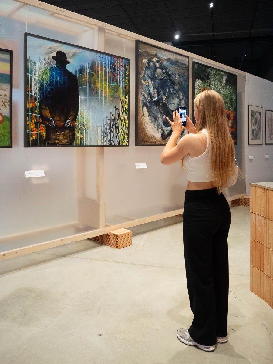
Ingrid and I went to ERM, the Estonian National Museum, while Adrian was off with a friend playing video games.

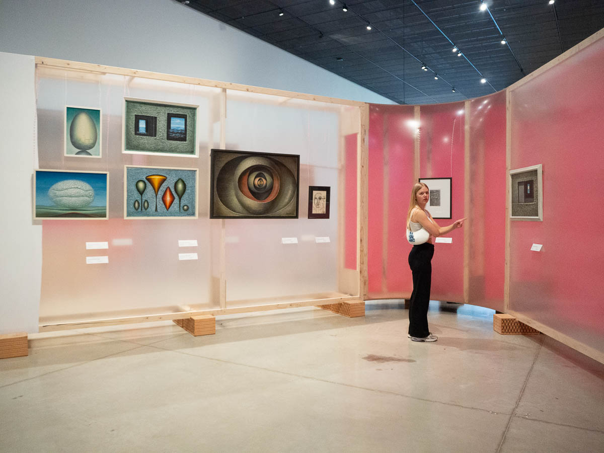
The main draw was an exhibition about surrealism in Tartu and Prague, a collaboration between museums in the two cities. Some of it was interesting, but some works looked more like “general weird” than surrealism to me.


The other current exhibition was about the city at night – one part about nightclubs and bars (most underwhelming) and another about the city at night through the eyes of animals. A wall about people’s encounters with foxes was somewhat interesting, but not much.

A third one was about Bling, which seemed to be an Estonian equivalent of Burning Man. Great for the people who had been there, but I’m not sure what the rest of us were supposed to get out of photos of them having fun.

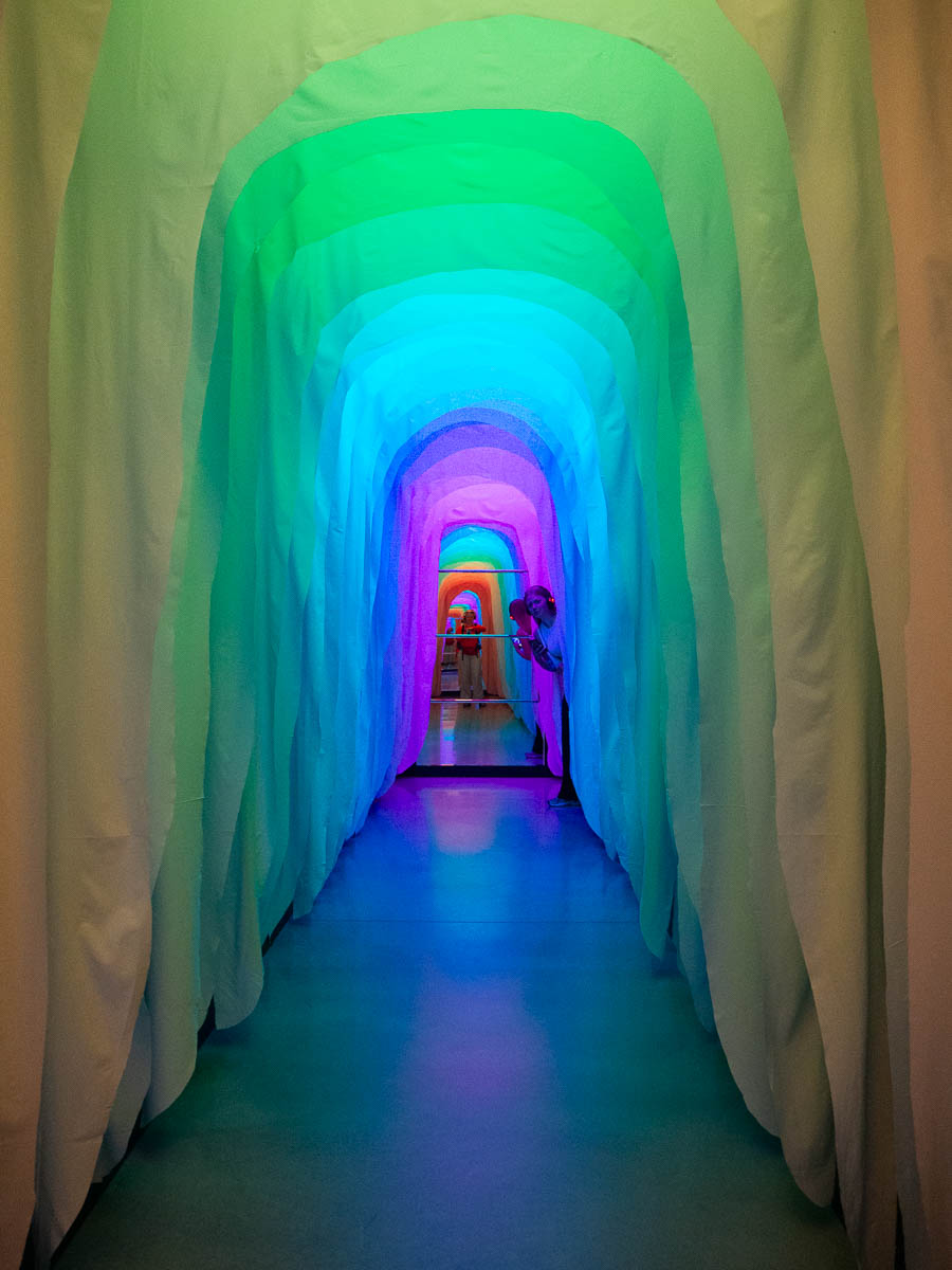
The entrance to that area was a cool installation of textile and light, though.

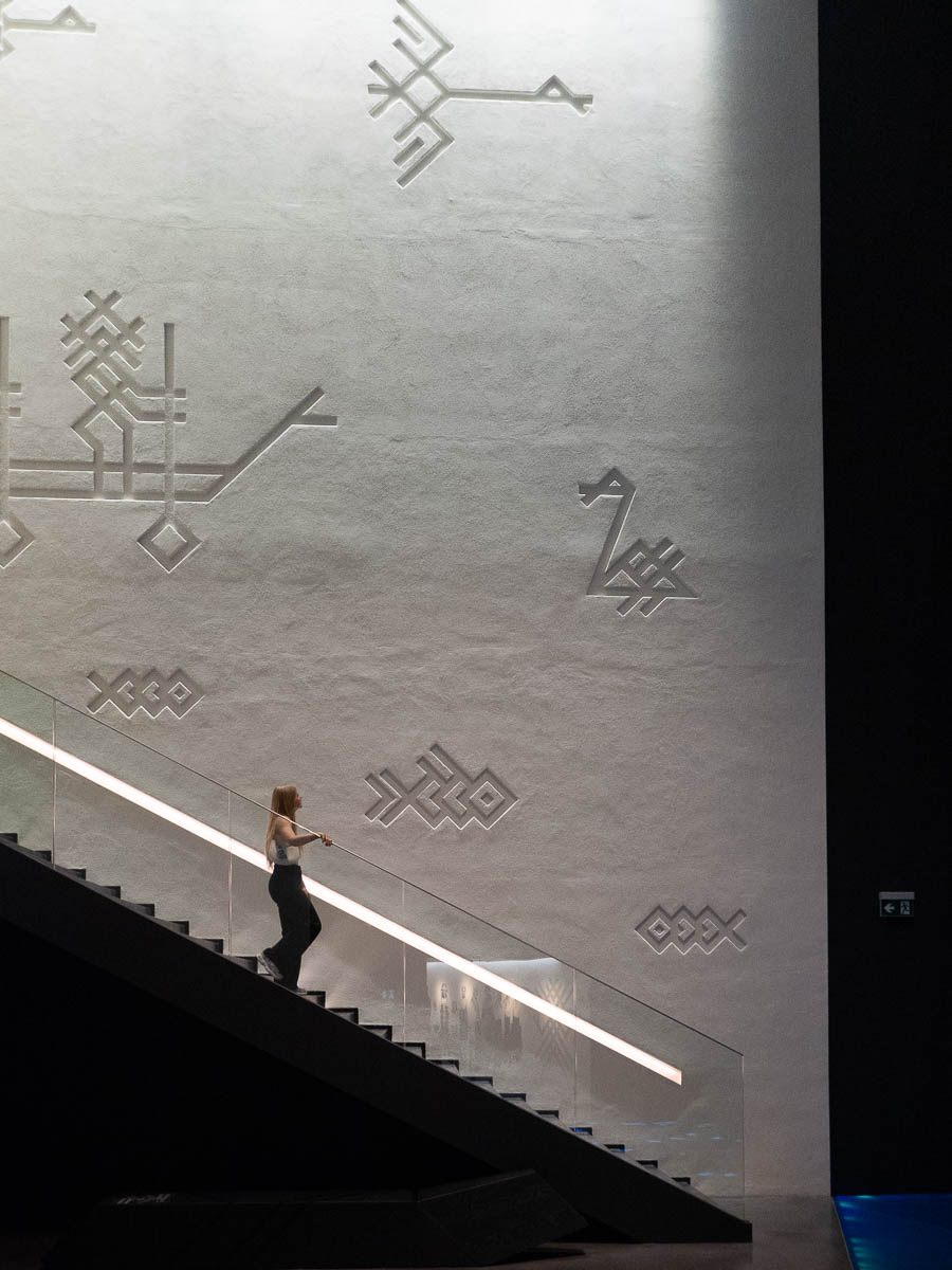
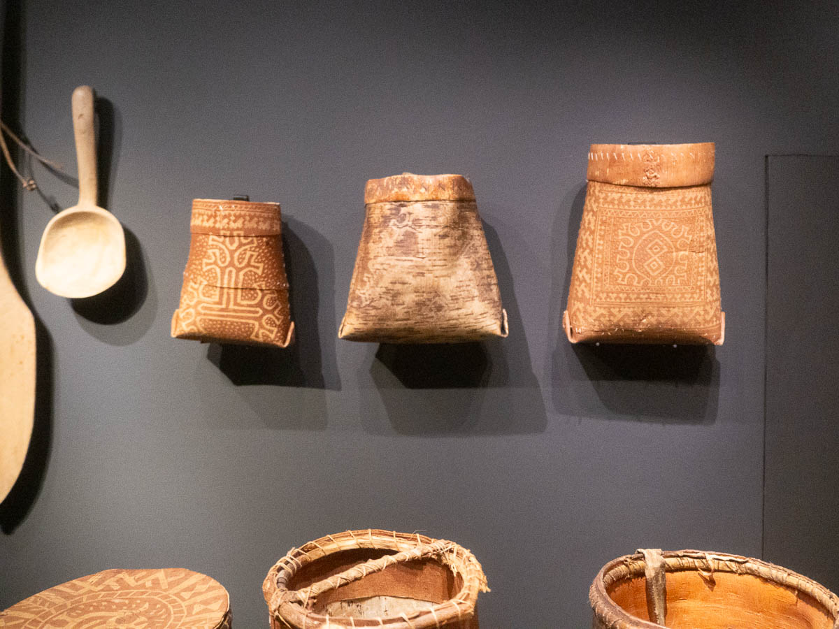
We finished off our visit by strolling through my favourite permanent exhibit, Echo of the Urals, about our “cousins”, all the other Finno-Ugric people. I especially like the visual design of the exhibition space, and the icons and signs derived from traditional Finno-Ugric decorative patterns and old Estonian house marks.


Ahhaa science centre.

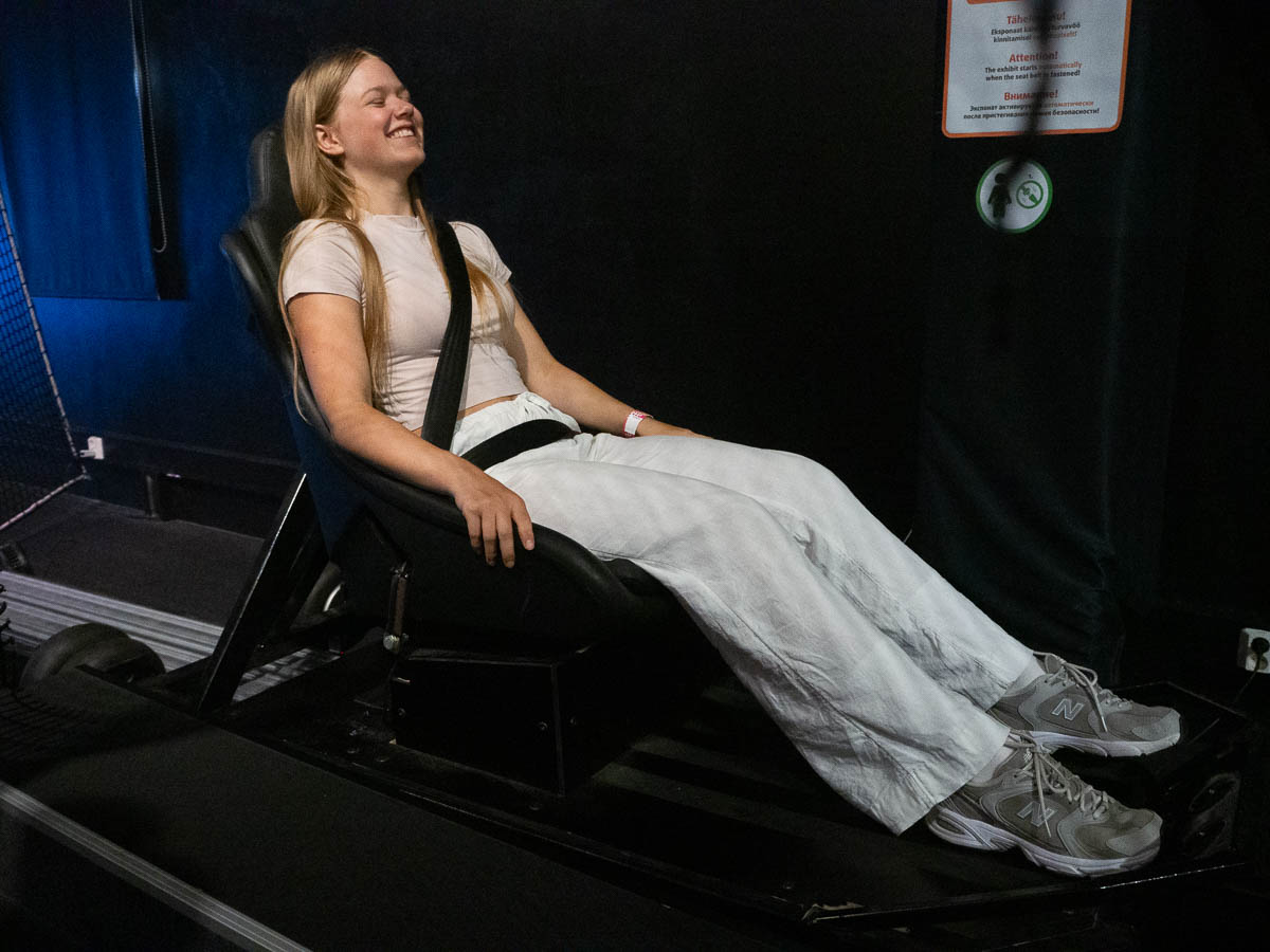
About two thirds of the space holds a permanent exhibition, while the remaining third is used for temporary ones. Past exhibitions have ranged from “spies and detectives” to “nutrition”. Currently the theme of the temporary exhibition is “adrenaline”. In effect, it was a small-scale amusement park for older kids.

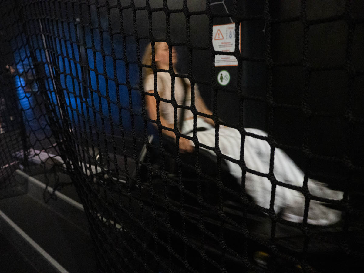
There was a “rocket chair” for acceleration…

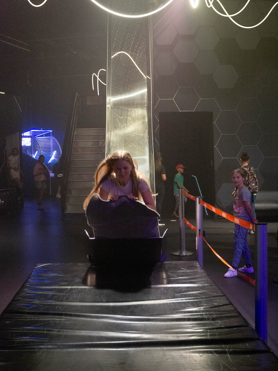
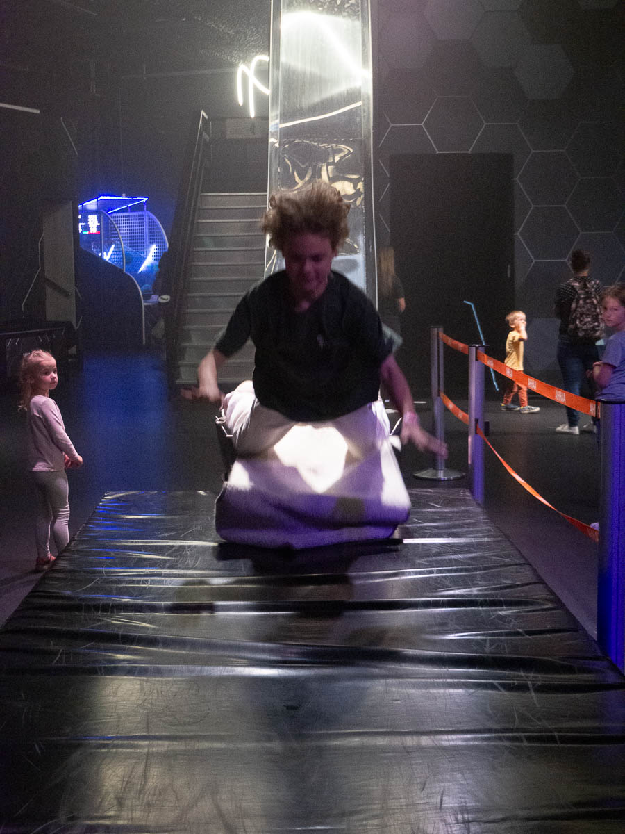
… and an extra steep slide, with a thick mat to land on…

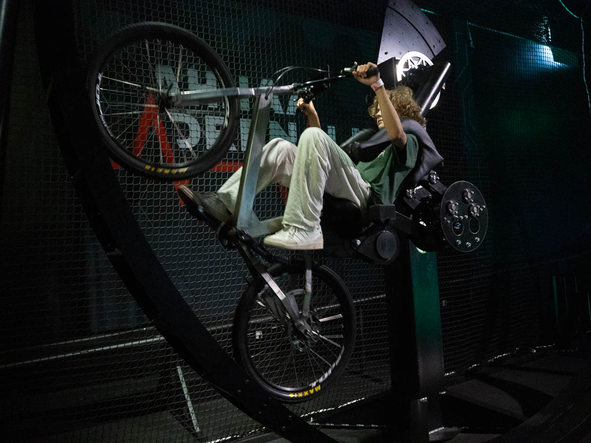
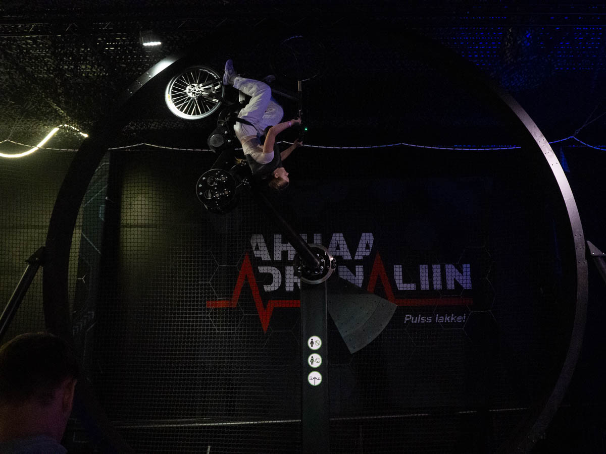
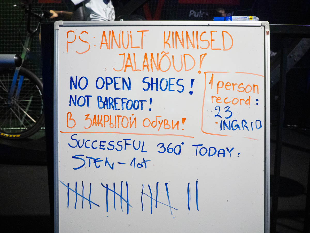
… and a 360 degree loop bicycle ride. All three of us tried it, but Ingrid was the only one to manage the full 360 degrees – there was something wrong with the pedals on the bike that sometimes made them go backwards forcefully when the bike itself rolled backwards, and when that happened, we kept losing our footing and got hit in the shins by the pedals. Ingrid somehow got past that and beat the day’s record of most consecutive loops.


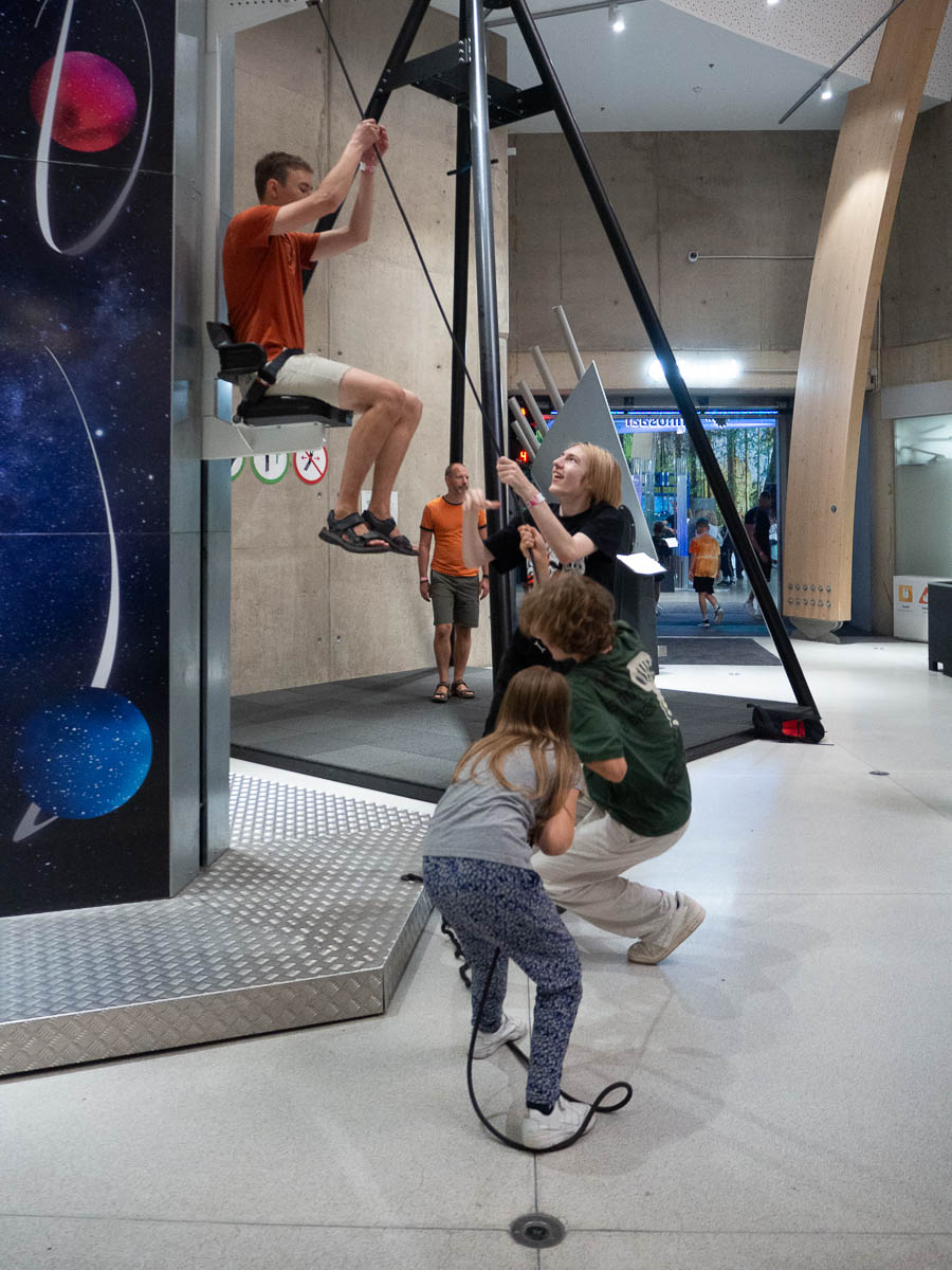
The permanent exhibition also has plenty of hands-on experiments. Like using a rope and pulley system to lift up your friends, and learning how the number of pulleys affects the force required…

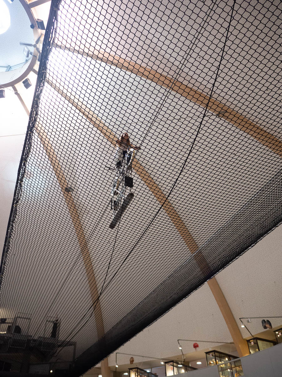
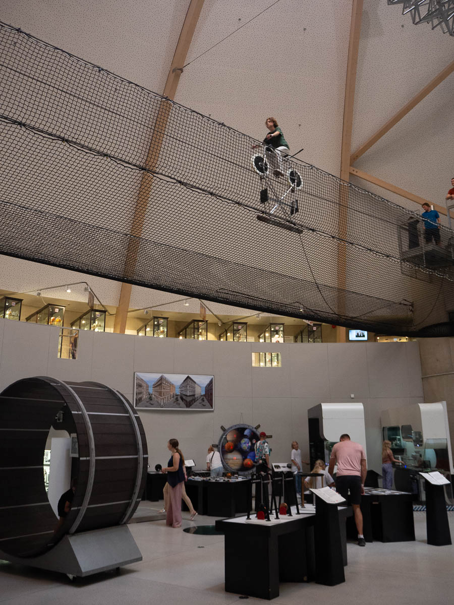
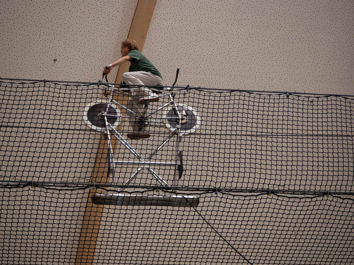
… or riding a bike on a tightrope, and learning how a counterweight makes balancing trivial.