I wasn’t entirely satisfied with my last exercise for the black and white embroidery course. I touched up the shapes to make the proportions better, and that helped. The difference is perhaps subtle in a photo but obvious when I hold the piece in front of me.
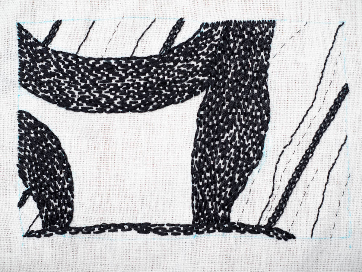
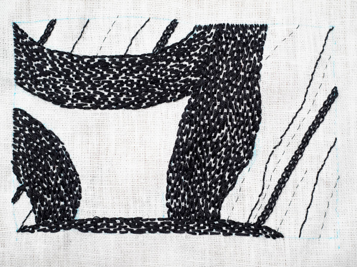
The surfaces are still not as black as I would like. I preferred the appliqué look with its proper, deep black. But the teacher argued that embroidery is about stitches, and a stitched surface has more character than plain appliqué, and I can see the point. Her suggestion was to paint the surface where I want it fully black.
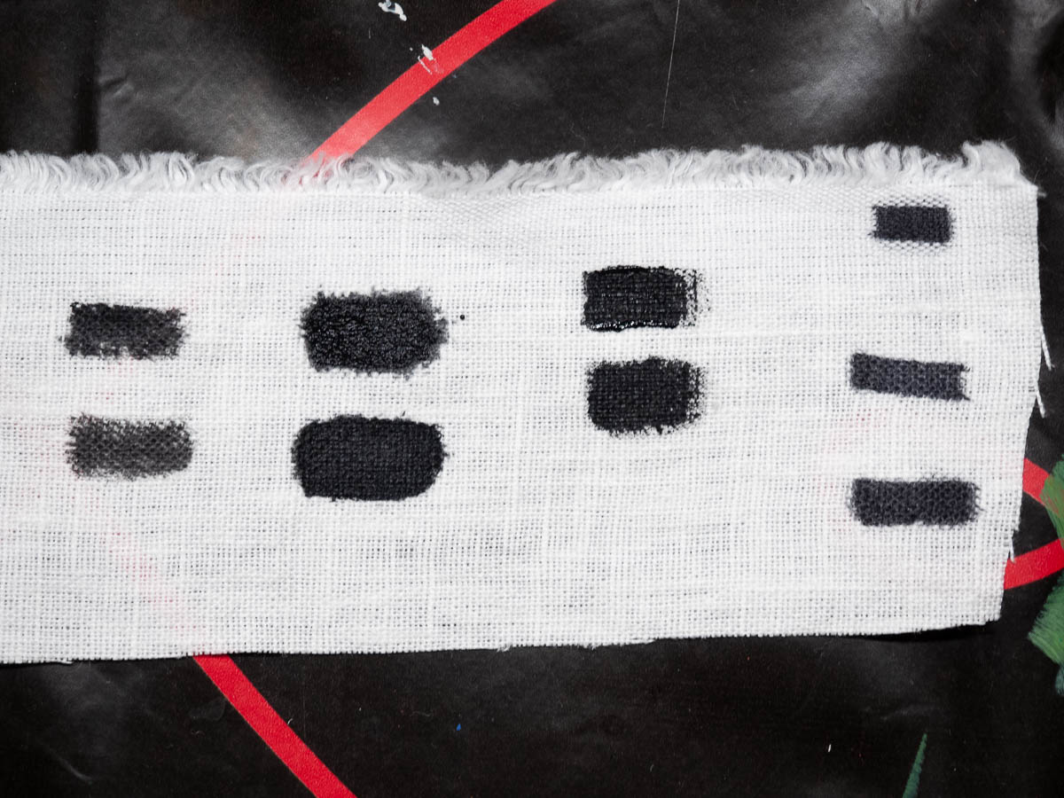
Had I planned for this, I could have painted those parts of the fabric before embroidering. Now I’ll have to do it after. I don’t have black fabric paint but I do have black acrylic. I’m now experimenting with watered-down acrylic paint to see how it affects the look and feel of the fabric.
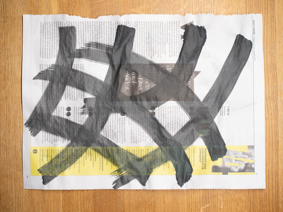
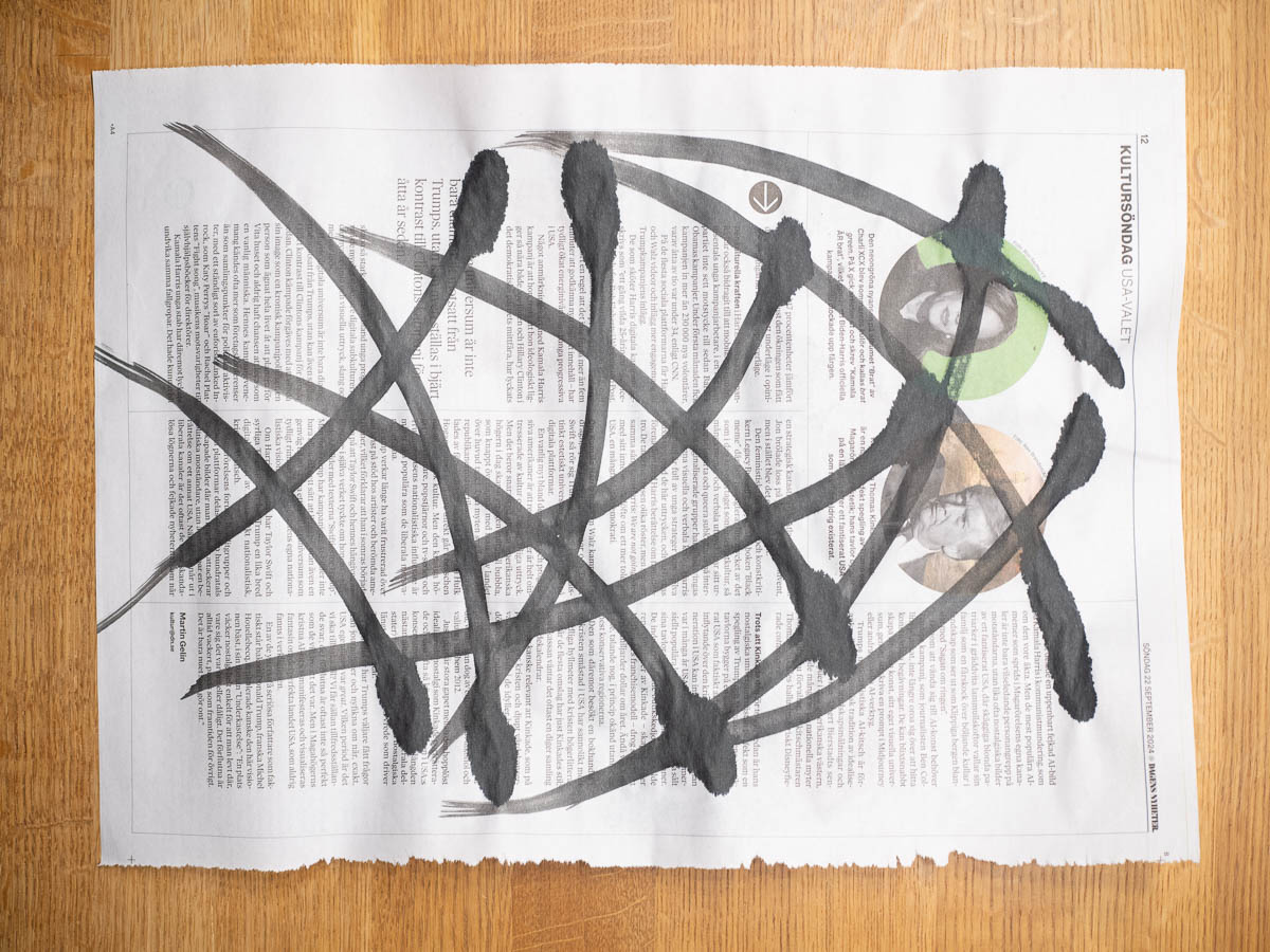
Speaking of paint, our second exercise is to paint on newsprint with Indian ink and use that as a starting point for our embroidery design. I don’t think I’ve ever worked with Indian ink. One immediate learning is just how much the brush matters for this. I had one broad, thick, stiff brush and one smaller one, much softer. The thick brush held on to the ink and gave me even, smooth strokes. The soft brush gave up most of its load of paint as soon as it met paper, then ran out of ink before I even finished the stroke, and the brushstrokes came out as blobs with tails. Both brushes are from the same main street hobby store, so I guess it’s not even a matter of quality but just type of brush.
Leave a comment